Customers Module
View Navigator
View Navigator
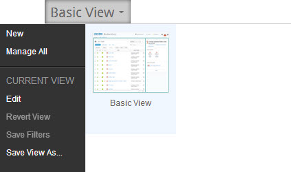
Clarizen's View Navigator 'out-of-the-box' default view options vary from module to module. The figure below shows the sole Customers module out-of-the-box' default view option (Basic View).

Grid
Grid
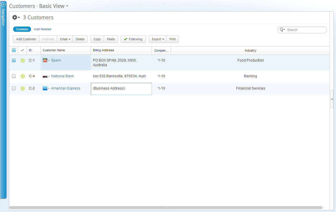
The grid is Clarizen's standard data table display for viewing, managing and editing data and items in most modules.
A grid display is one of three display type options used to configure several of the out-of-the-box view options available in the View Navigator for most modules.
Using the Time Range Filter enables filtering the grid to show items and events occurring during the actual period/date(s) defined.
Clicking the  icon, located above the ribbon enables managing grid column sets which can then be further filtered and sorted.

Figure 2: Customers Module Grid
Searching and Filtering
Searching and Filtering
The Customers module can be searched and filtered for items and data using the Contextual Search and the Time Range Filter.
Note: Clarizen can be searched globally using the Global Search tool.
Ribbon
Ribbon
The Customer module ribbon, located under the masthead (at the top-left) provides controls for performing actions on selected items.

Relations Panel
Relations Panel
The Customer module grid display includes t he Relations Panel, located on the right-hand side of the screen.
The Relations Panel displays any related items, such as customer contacts, files, and discussions, etc.) of a selected item type in the grid, as well as cases including bugs, issues and requests, and enables working with the related items while staying in context of your original view.
The panel is blank when multiple items are selected.
Properties Card
Properties Card
Customer properties cards can be accessed from the Customer module by selecting the item in the grid, and clicking  located in the Relations Panel.
Comments