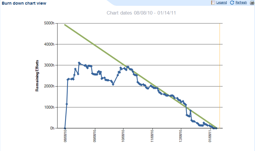
I believe what you described is exactly how the current chart works. The total outstanding work (remaining effort) for the work item you select is on the vertical axis and time is on the horizontal axis. The work is plotted on a daily basis, but the chart is not retroactive--meaning if it was just enabled today it will only have one day of data. The green bar is a straight-line "ideal" burndown. If you are above the green line then you are behind the ideal burn down of hours and if you are below then you are ahead of plan.

