Post
FollowCheck Mark color should match Text color
It turns out that the Check Mark we see in reports, dashboards, etc are all images; but there is only a BLACK check mark. We perform a LOT of "color coding" on Text and Field areas in order to highlight PROBLEMS with the data entered. End users require "visual cues" to understand that there is a problem, as we cannot "block" all Data Entry and sometimes it is easier to simply highlight "bad values".
For example, here we want to highlight an "invalid email" address and then display that the Customer will NOT receive a CSAT Survey.

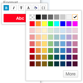
Seems simple enough; but the check mark is BLACK while the text is white. The WHITE contrast against the RED background makes it very legible; while the BLACK against the RED background is not, so this might "confuse" some users. It is about maintaining a consistent "look and feel" for certain highlight combinations, because we can see the color pallette available for Text, but it does not seem to apply to symbols.

At the very least, Symbols (Check Marks) should have the first TWO rows available as a color selection, so that we can ensure some basic consistency between Text and Symbols.
Please sign in to leave a comment.