Post
Follow
Allow Bar Graphs to hold more values on the non-grouped axis
Scenario:
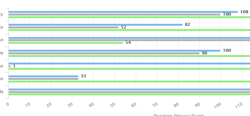
Created a Cluster Horizontal Bar Graph
Report Filter:
- Users: Show all consultant under a particular manager
- Time Period: During a specified time range
- Show Approved timesheet hours
Report Build:
User > Daily Capacity Timephased Data
- x-axis = name
- Grouping = Target hours, Utilization hours, Another set of hours
Goal is to create a graph for managers that shows all user's hours that contribute to their utilization %.
Results:
Expected result. The graph came out organized as I would like it to be. See screenshot below.
Issue:
I can only have a maximum of 7 users on the x-axis. The manager has 9 direct reports. The graph is almost a REALLY good graph to quickly and easily display data to our management. However, there are small pitfalls like this that make the almost-perfect displayed data, pretty redundant.
For this graph as an example, now the manager would have to scroll down to the table to review the data. It's no longer easily consumable and becomes much more tedious to review the data.
Graph Error:
The chart is displaying a subset of the results
Asks
- Greatly increase the limit of values that show up on graphs axis
- Provide the report creator more editable function so that the report creator can decide how many values should show up in the graph.
-
Please sign in to leave a comment.