Post

2 followers Follow
0
Avatar

Toggle display X for unselected items.

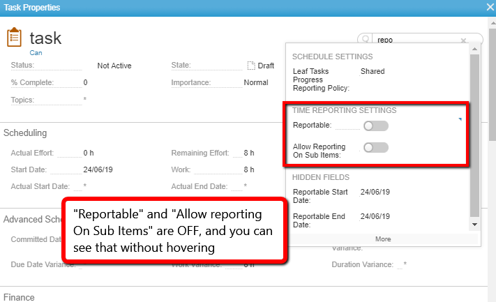
When you display a toggle, it's very difficult to see that it's NOT been selected (ie. that it's not just a text field, but that it's a toggle, and it's currently marked as FALSE)  unless you hover over it to see toggle unselected.


Can you put a "X" or "No" or some other visual clue to the user? You've got the visual tick, so it makes more sense to have a visual for the negative also?

Andy Johnston (AU) Answered

Please sign in to leave a comment.

4 comments

1
Avatar

Hello Andy, 

Please try the following CSS and let me know if that helps. 

.bool-false .bool {display: inline-block; background-position: 0 0px; background: url(../../images/icons/bool-toggle.png?version=20190627.17) no-repeat !important;}

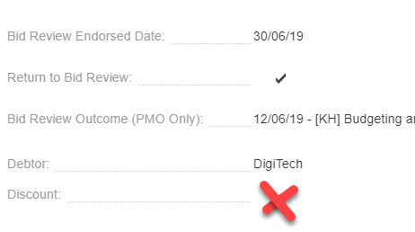
Result: 
Please let me know if this is helpful.

Thank you,

Roland

Roland Pumputis 1 vote
Comment actions Permalink
0
Avatar

Unreal Roland!  That did the trick!  Sweet.

Another question - if I create a custom icon "X" in the same style as the tick - can a CSS guru convert that into that URL component in the CSS?

eg.  .bool-false .bool {display: inline-block; background-position: 0 0px; background: url(MYCUSTOMX.png) no-repeat !important;}

Andy Johnston (AU) 0 votes
Comment actions Permalink
0
Avatar

Hello Andy,

You can use a custom icon, but you can use an OOTB icon as well:

.bool-false .bool {display: inline-block; background-position: 0 0px; background: url(https://app2.clarizen.com/Clarizen/Image35.21.0.1.1.aspx?version=minor_19_0_20190627.17) no-repeat !important;}

.bool-false .bool:hover {display: inline-block; background-position: 0 0px; background: url(../../images/icons/bool-toggle.png?version=20190627.17) no-repeat !important;}

The above will show red X when not hovering over and disabled toggle when hovering over the field. If you don't want the hover effect, do not use the second bit.

Please let me know if this helps.

Thank you,

Roland

Roland Pumputis 0 votes
Comment actions Permalink
0
Avatar

Hey Roland - I just implemented this today, and it's AWESOME.

It's pretty much exactly what I was looking for.   Thanks again for your help.


One minor question, becuase the PM team lead asked - do you have a black "X" instead of a red as an OOB URL I can use? They wanted it to stand out slightly less.

Andy Johnston (AU) 0 votes
Comment actions Permalink