
What Are Clarizen Views?
This page describes Clarizen views and includes the following sections:
About Views
Clarizen's views provide a 360 degree view of information within the system.
Views together with Clarizen Profiles, provide each user with the optimal way of absorbing information to successfully manage and execute work.
Whether focusing on a specific item such as a project or a task, or viewing a list of tasks a team is working on, viewing information in multiple layouts, data sets, field sets and other customizations, views are ideal for organizing data for the organization's specific needs, and those of the users within the organization.
Using the View Navigator, you can choose from an array of the system views created by Clarizen, public views customized by an organization's Clarizen Admin, or your own private view created to suit their own specific needs.
Users can customize any view according to their View Permissions setting.
On-the-fly customizations to a view using filters, column sets, related items and more can be made on top of the view's customization to change perspective without needing to edit or create a new view, providing the entire organization with maximum perspective flexibility for viewing and managing data.
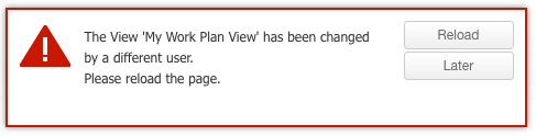
When you make changes to a shared view (e.g. add or remove columns), the next time users access the view, a pop-up window is displayed to notify them of the changes.
Note: Users are not notified when changes are made to view's filters.
Two View Types
Clarizen has two main view types:
- Module views Module views display and enable managing information for an item type (tasks, users, timesheets, etc.).
Module views can be general or team-centric; views centered around a team. - Item Detail Views Accessible when navigating by drilling down in any specific item; Item detail views display and enable managing information in context to that item (project, group, request etc.).
Both view types differ in intent, layout and customization capabilities.
However, the navigation, management and ongoing work with both view types are very similar.
About View Sharing Permissions
Each module or item type has its own specific set of views.
All users can create private views for their own use
Sharing views is permissible to administrators or super users by default, the organization may also enable view sharing capabilities to all users from within the system settings.
Views can be shared with users, groups, virtual groups and can even be associated with a profile.
Note:
Virtual groups are generic groups created by the system to assist you in the sharing process and include: All, Administrators, Super Users, Direct managers, Internal and External users, and Financial Users
Profile based assignment of views in the view editor automatically links the view to the profile in the Profile system settings as well
Team-Centric Views
Team-centric views are views that include Clarizen's Team Panel. Team-centric views enable focusing on the team and filtering data in the main panel by the entire team or specific team members.
The Team Panel provides a view of data centered on a specific team or group; for example your team, including direct reports, direct manager colleagues (team members that have the same direct manager), a project team, or any user or discussion group.
The Team Panel can be included to any task view, as well as cases, timesheets or expense sheets views.
- Click here for more on team-centric views.
View Navigator
View Navigator
Navigating between views in Clarizen is done via the View Navigator.
This page describes navigating between views and managing the View Navigator.
The page includes the following sections:
- Accessing the View Navigator
- About the View Navigator
- Selecting Views
- Managing the View Navigator
- Accessing the View Manager
- About Hiding Views and Managing Hidden Views
- Hiding Views
- Managing Hidden Views
Accessing the View Navigator
The View Navigator is accessed via the link located directly beneath the company name on the masthead.
- Click the View Navigator link.
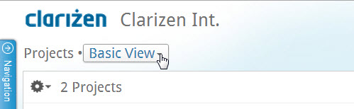
Figure 1: View Navigator Link
The View Navigator opens.
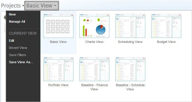
Figure 2: View Navigator
About the View Navigator
There are two sections on the View Navigator; on the left is a menu for managing and editing views, on the right are thumbnails representing the views available.
The menu has two sections; the upper-section options for creating new views, and for accessing the View Manager (to manage personalized view sets), the lower section options for managing the view that is currently selected.
Views in the View Navigator include Clarizen out-of-the-box views, Admin user - defined views (if such exist), and when relevant, views 'owned' (or 'personalized') by you, the licensed user.
Note:
A view can be customized and saved ( on top of the Clarizen view) for future, regular use, depending on the view's privacy settings and 'share' permission.
Selecting Views
- Click the View Navigator link.
The View Navigator opens. The currently selected view is highlighted in blue. - Hover the mouse pointer over an unselected view.
The view becomes highlighted in yellow. The currently selected view remains highlighted in blue.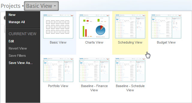
Figure 3: View Selection - Click the view.
The View Navigator closes. The screen refreshes in the selected view, the View Navigator link text updates with
the selected view's name.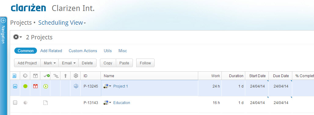
Figure 4: Scheduling View
Note:
The selected view is auto-saved by Clarizen and becomes the module's default view (including after you log out) until you select a different view.
Managing the View Navigator
Managing the View Navigator is done via the Clarizen View Manager , accessed by clicking Manage All in the View Navigator menu.
This section describes managing the View Navigator and includes the following sub-sections:
- Accessing the View Manager
- About Hiding Views and Managing Hidden Views
- Hiding Views
- Managing Hidden Views
- About Reordering Views
- Reordering Views
Accessing the View Manager
Depending on your user permissions and each view's 'sharing status', the View Manager can be used to edit views, delete views, or hide views (from the View Navigator) and manage the hidden views, as well as to customize the View Navigator layout.
The views you can manage may include:
- 'Out-of-the-box' Clarizen views
- Public views or financial views (defined by users with permissions to do so in accordance with system settings, not necessarily the Admin user)
- Privately owned views personalized by you
About Hiding Views and Managing Hidden Views
The View Manager enables defining views to be 'hidden' from the View Navigator.
For example, you can minimize the amount of views visible on the View Navigator to better suit your needs for completing a specific task in a specific module.
Once views are set as hidden, you can manage whether hidden views are visible or not in the View Manager.
Hiding Views
To hide a view:
- Click the View Navigator link located under the company name on the masthead.
The View Navigator drops down.
Figure 5: The View Navigator - Click Manage All .
The View Manager opens (replacing the View Navigator).
Figure 6: View Manager - Click
 on view thumbnails to hide.
 - Click

The thumbnails disappear. The View Manager closes.
The views are now hidden (not deleted) from both the View Navigator and the View Manager.
Tip:
The thumbnail Edit button accesses the View Editor.
Managing Hidden Views
To manage hidden views:
- Access the View Manager.
- Click Manage hidden views , as shown in Figure 7, below.
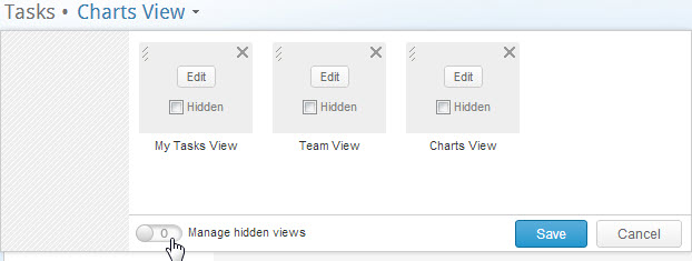
Figure 7: Managing Hidden Views
The switch becomes checked
Views set as hidden are exposed, and appear with , as shown in Figure 8 , below.
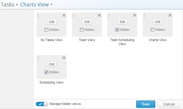
Figure 8: Show Hidden Views - Click
 to re-hide the views set as hidden.
The switch control becomes .
.
Hidden views disappear from view. - Click

The View Manager closes.
About Reordering Views
The View Manager enables defining the thumbnail layout on the View Navigator. For example, your favorite, or most-used view's thumbnail location in the View Navigator can be reordered to be first, in order of appearance, for easier accessibility.
Reordering Views
To reorder the views:
- Access the View Manager

Figure 9: View Manager - Hover the mouse pointer over the
 section of a thumbnail.
The mouse pointer changes to
- Click and drag the thumbnail to the desired location.
- Complete reordering thumbnails as necessary.
- Click

The thumbnail order on the Views Navigator is saved.
View Types
Module Views
This page describes Module views, a system view type for presenting information and enables managing one or several item types in Clarizen. This page includes the following sections:
- Accessing Modules
- About Module Views
- About the Relations Panel
- Hiding and Unhiding the Relations Panel
- Expanding Panels
- About Data Previews
- Team-Centric Views
Accessing Modules
When entering Clarizen for the first time, the Social module opens (DEFAULT) in a Clarizen Module view .
Further modules can then be accessed either via the Navigation Panel or from a current module (via the View Navigator).
Some modules can be accessed from specific locations, such as Discussions module, accessed by clicking a dedicated button in the Social module.
To access a module via the Navigation Panel:
- Click anywhere on the partially collapsed Navigation Panel (located on the left-hand side of the screen).

The Navigation Panel expands .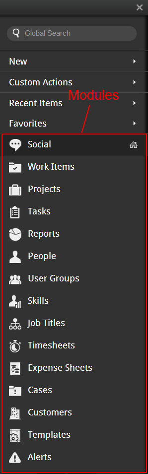
- Select a module .
The selected module opens in a default Module view (upon initial access), or in the last selected Module view type.
Note:
Module views are auto-saved, thus maintaining the view type from the previous session.
About Module Views
A Module view displays and enables managing, one or several, item types' information. Module views are built in a master-detail format and when displayed as a grid, are divided into separate panels. The main panel displays the main item type(s) of that module. Certain modules can also be displayed as charts or as thumbnails.
About the Relations Panel
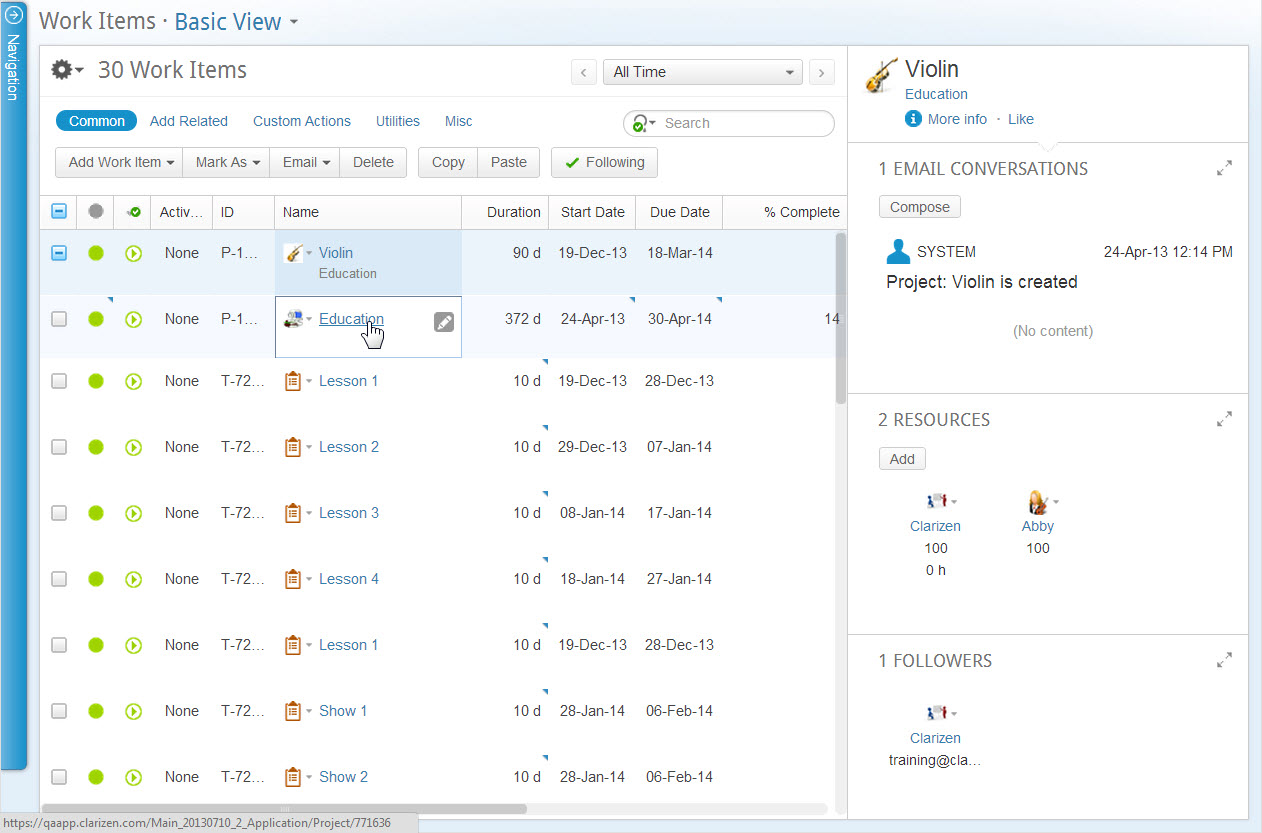
Module grid displays include the Relations Panel, located on the right-hand side of the screen. Figure 11 (below) shows an example of a Module grid display.
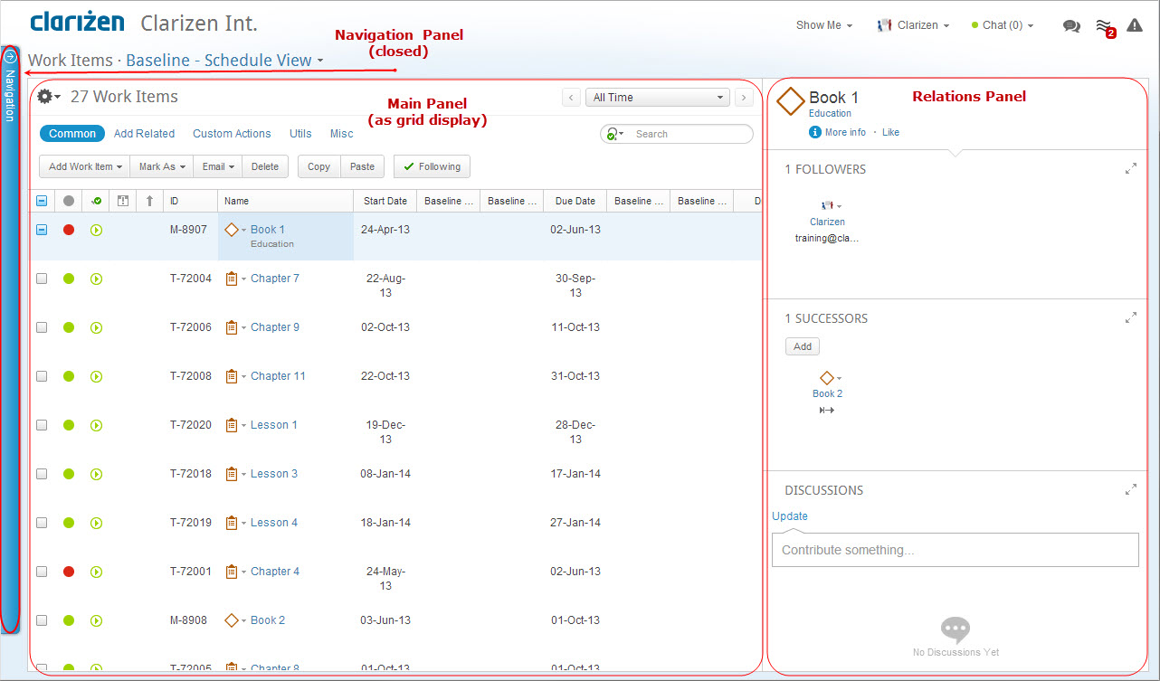
Figure 11: Work Items Module Grid Display
The Relations Panel displays any related items, such as assigned resources, files, and discussions, etc.) of a selected item type in the main panel, and enables working with the related items while staying in context of your original view.
The panel is blank when multiple items are selected.
You can update a related item field directly from thumbnails or grid displays by clicking the  'Quick Peek' to view all files and other items directly related to the main item selected. In this way, constant focus remains on the current view, whereas viewing details on any related information is readily available.
The ability to maximize the panels within the Relations Panel enables viewing a complete list of all related items, enables searching, filtering and sorting through items, as well as running any actions on selected items.
An Add Related option enables adding related items to the currently selected item or item type.
Relations panels are fully customizable. Choose the display option of thumbnails or grid for each panel, and which fields are displayed for narrow and maximized modes. Any filters and sorting options used in maximized mode are 'remembered' by Clarizen for the future after a panel is minimized.
Note:
The Relations Panel is blank when multiple items are selected.
The Properties Card layout is fully customizable by your organization's Admin user. The icon and data fields are editable at the user level.
The Relations Panel includes an Add Relations panel for adding related items to the selected item type.
Added related items appear in the Relations Panel.
Hiding and Unhiding the Relations Panel
- Hover the mouse pointer over the Relations Panel border to expose the

- Click

The Relations panel is hidden. Notice the on the screen's far right side.
- Click
 to unhide the Relations Panel.
- Click
Expanding Panels
The Properties Card and the Relations Panel panels are expandable.
- Click
 located at the base of a Properties Card to view and edit item properties
 - Click
 located on a panel's upper-right section to populate the entire screen with that panel
 - Click
 to retract the panel to its regular viewing size
About Data Previews
Data previews are available in several locations in Clarizen, including:
- Thumbnails
- Grid relation fields (resources, dependencies)
- Adjacent to item identifier fields (item name)
- Relations Panels
Hovering the mouse pointer over an item name in the above locations exposes the  Quick Peek .
Clicking it opens a data preview window while staying in context of the current item view.
Team-Centric Views
This sub-section describes team-centric views and includes the following sections:
- About Team-Centric Views
- The Team Panel
- Selecting a Group or Project Team-Centric View
- Filtering by Team Member and Work Items
- Configuring the Team Panel
- Configuring Team Member Settings
- Reassigning Tasks
- Overloading Tasks
- Assigning a Team Member to a Task
- Chat, Follow and Load Checking Options
- Adding Group Members, Resources or Direct Reports
About Team-Centric Views
Clarizen team-centric views enable viewing data centered on a specific team or group of users, including user groups and discussion groups, or a project team, including all work items and cases related to each user.
In line with Clarizen's focus on team collaboration and participation, team-centric views provide assistance for team members to monitor and manage their tasks as well and collaborate with other team members by balancing workloads, thus ensuring successful progression of the project and its planning.
An important part of creating projects typically includes mapping out a plan to enable monitoring the progress of the project and assigning resources as 'team' members to work items.
A Clarizen team is one typically comprised of group members, a discussion group, a project's resource pool or the Clarizen view feature My Team , which isolates (filters) all the work items, cases, timesheets and expense sheets related to the user.
Note: Team Views can display a maximum of 1000 team members. We recommend filtering the view by Group or Project.
The Team Panel
The inclusion of the Team Panel to a Module View defines the view as team-centric. The Team Panel can be included to any module with a defined role, such as the Work Items, Cases, Expense Sheets or Timesheets modules.
Team Panels provide methods for focusing on an entire team and filtering data by various team members, for viewing each member's availability, seeing who is currently online, for initiating chats, for following users and for providing a means of balancing work between members.
When a team-centric View is first opened, 'My Team' appears in the Team Panel drop-down selection field, and 'Me' (representing your User profile) is selected. The module's main panel includes all work items to which the currently selected team member (in this case you) has a role.
Other users assigned to your team are also listed in the panel, including (when relevant) your direct manager, team members working under your direct manager, and your direct reports.
The  icon adjacent to a member's name indicates that the member is currently online .
The  icon adjacent to a member's name indicates that the member's workload is currently overloaded.
An out-of-the-box example of a team-centric view is the Team View available in the Task module.
Figure 12: Team-Centric View
Selecting a Group or Project Team-Centric View
A group team-centric view displays data in the main panel of a specific team or group of users, including user groups and discussion groups.
A Project team-centric view displays data in the Project team main panel, including all work items and cases related to each user.
Select a Group or Project :
- Click
 to open the panel option menu.
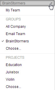
Figure 13: Team Panel Options
The team view currently selected is indicated as such by a checkmark in option menu.
Recently accessed user groups appear listed below Groups, below that is the 'Choose' option.Note:
The last team selected appears as the team currently selected, including after a screen refresh.
Recently accessed projects appear listed below Projects , below that is the 'Choose' option.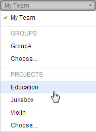
Figure 14: Select Project - Select either a Groups or Projects option.
The view opens accordingly.
OR
Select Choose.... for either category; the relative Find window opens.
- Configure the find window as required.

Figure 15: Select Project Window - Click

The selected Groups or Projects view opens, the main panel refreshes to display all members of the selected group or project.
- Configure the find window as required.
Filtering by Team Member and Work Items
The module's main panel displays all the work items to which the currently selected team member has a role.
When Me is selected, the main panel displays all the work items in which you have a role.
When Everyone is selected the main panel displays all work items in which all team members have a role.
Show only data related to a specific team member :
- Click a team member listed in the panel.
The selected team member's name is highlighted in the Team Panel and the member's related work items are displayed in main panel.
Configuring the Team Panel
- Click
 located in the lower Team Panel.
The Team Members/Show Tasks pane opens.
Note:
The Show Tasks pane is only available when a project is selected in the Task module.
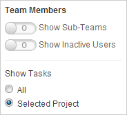
Figure 16: Settings
Team Members
- Click
 to add sub-teams or inactive users to the Team Panel
The control refreshes as
- Click
 to hide sub-teams or inactive users from the Team Panel
The control refreshes as
Show Tasks
All: When checked, the main panel shows all tasks that each user is assigned to.
Selected Project (DEFAULT): when checked, the main panel shows only the tasks each user is assigned to, relative to the specifically selected project.- Select ALL or Selected Project to define which team member tasks are included in the main panel.
- Click
- Click
 or anywhere outside of the Team Panel Settings pane to hide the pane.
Configuring Team Member Settings
Edit your team member options, including chat and Following, or view your own work load or other team members' work loads.
- Hover the mouse pointer over the highlighted 'Me' profile to expose

- Click
 to view your own Clarizen system work load.
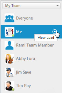
Figure 17: View Own Load
Reassigning Tasks
Reassigning members tasks can be done directly from the grid.
- Select one or more tasks in the grid to be assigned.
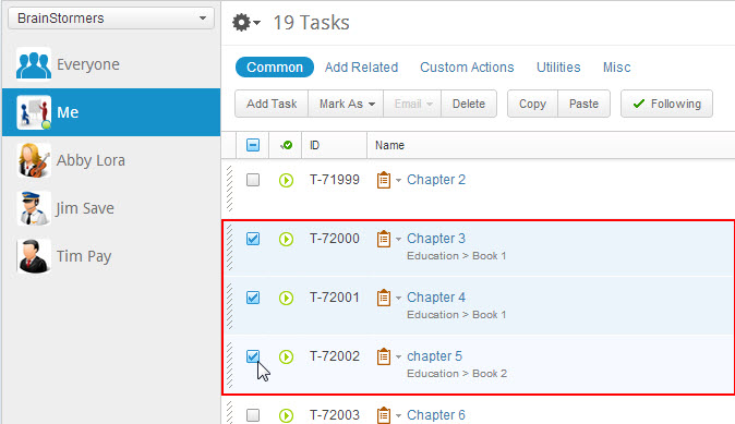
Figure 18: Select Tasks
Tip:
Clicking and dragging to select tasks is supported when selecting multiple tasks in series.
- Hover the mouse pointer over a selected grid cell tag

The mouse pointer becomes
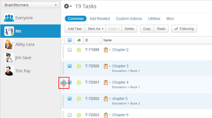
Figure 19: Position Mouse - Click and drag the selected tasks to the required team member (Tim Pay in Figure 20).
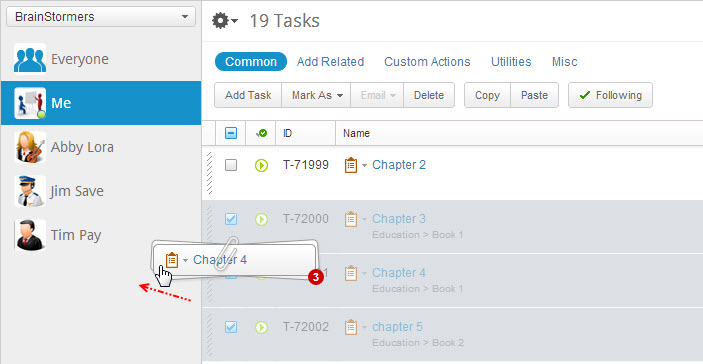
Figure 20: Drag Tasks To Member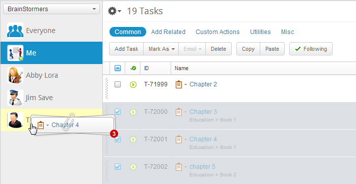
Figure 21: Drop Tasks on Member - Release the mouse button to drop the tasks on the required team member.
A timed pop-up message prompts to confirm the action.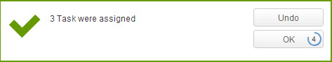
Figure 22: Tasks Assigned - Click

The tasks are assigned.
Note:
If the pop-up times out before clicking, task re-assignment is canceled.
Overloading
Clarizen calculates resource workloads and notifies when reassigning resources with tasks overloads their workload.
Example:
In this procedure, team member Tim Pay is shown as 'overloaded', whereas Abby Lora's workload is close to maximum capacity.
- Click and drag selected tasks to the required team member (this time Abby).
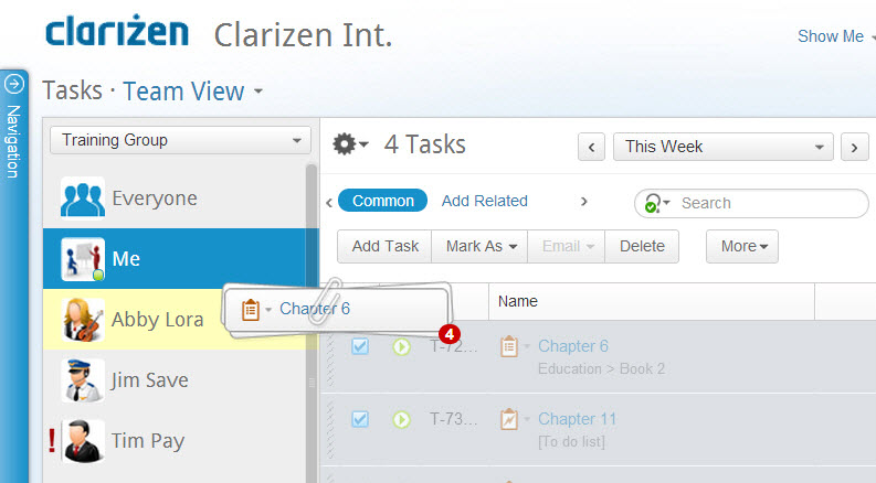
Figure 23: Drag Tasks to Abby - Release the mouse button to drop the tasks.
Clarizen calculates the workload and as a result Abby becomes overloaded in the selected time range.
A pop-up message prompts of the overload.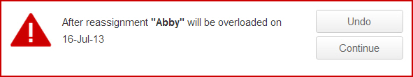
Figure 24: Overload Prompt
The icon appears adjacent to Abby's name indicating a workload overload.
- Click
 to revert the system.
OR
Click to continue the action.
Assigning a Team Member to a Task
Assigning a task to a team member can also be done directly from the grid.
Unlike assigning by dragging a task onto a user, dragging a user onto a task adds them to the resource pool, and you can add multiple resources this way.
- Select a team member to be assigned a task.
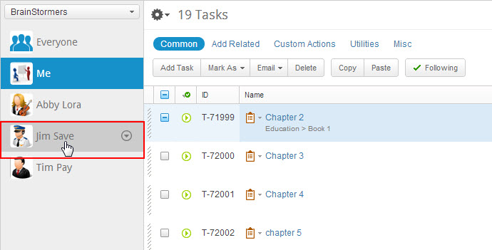
Figure 25: Select Team Member - Click and drag the team member to the task to be assigned to.
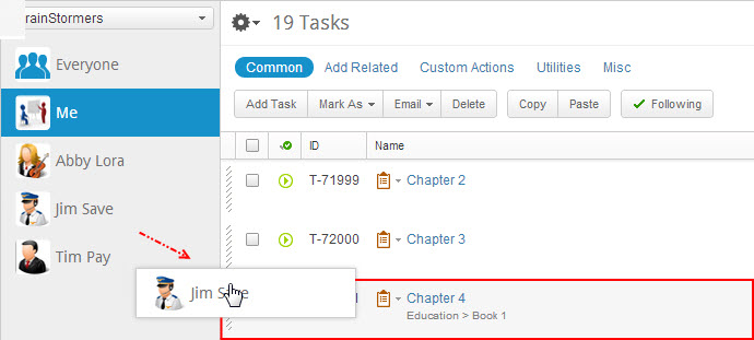
Figure 26: Drop Member on Task - Release the mouse button to drop the t eam member on the required task.
A timed pop-up message prompts to confirm the action.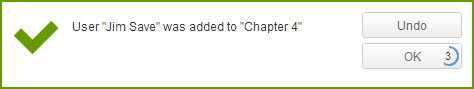
Figure 27: User Assigned - Click

The team member is assigned to the task.
Note:
If the pop-up times out before clicking, the team member is assigned to the task.
Chat, Follow and Load Checking Options
To initiate member chats, set 'Following' and to check member work loads:
- Select a team member, hover the mouse pointer over the highlighted profile text to expose

- Click the pop-up options to initiate a chat, view or alter the member's current 'Follow' status, or work load.
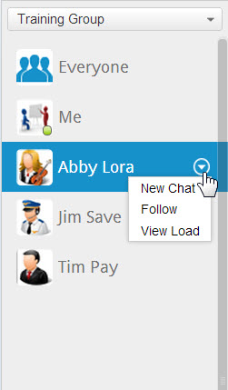
Figure 28: Member Options
New Chat
- Select New Chat to initiate a chat with the selected team member.
Following
- Place the mouse pointer over Following (shown only if you are currently 'Following' that team member).
The text changes to Unfollow , as shown below. - Click Unfollow to cancel following the team member.
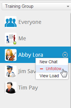
Figure 29: Unfollow
If you are not currently Following the selected team member, the text 'Follow' is displayed in the pop-up.
To change to Follow :
- Click Follow, the text changes to Following .
View Load
- Click View Load to view a team member's system work load .
Note:
An '!' indicator appears adjacent to a member's name whenever the member's work load is overloaded as the result of too many tasks assigned in a specific time set conflicting with current Time Range Filter settings.
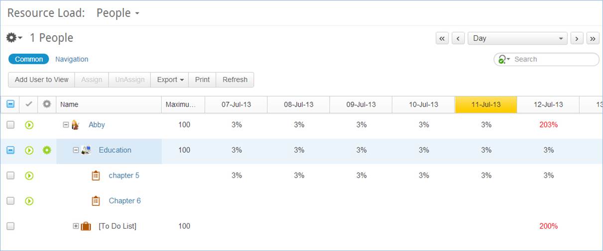
Figure 30: Resource Load Module
Adding Group Members, Resources or Direct Reports
- With a group, project or My Team selected in the Team Panel selector, click
 (located at the bottom of the Team Panel).
The relative multi-find window opens.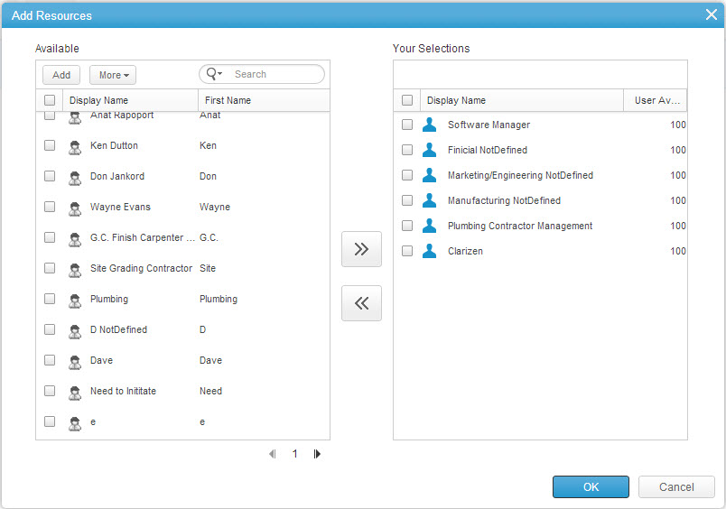
Figure 31: Add Resources - Configure as necessary.
- Click

The group member(s), resource(s) or direct report(s) addition is made.
Note:
Clarizen displays an alert message if adding a group member, resource or direct report causes that user's work load to overload.
Item Detail Views
This page describes Item Detail views, a system view type for viewing and managing an item's properties and its related items.
The page includes the following sections:
- Accessing Item Details
- About Item Detail Views
- Expanding Panels
- Docking Panels
- About Data Previews
- About Special Panels
Accessing Item Details
To access item details, you must first navigate (or 'drill down') to the item.
Items in Clarizen are represented by the item's name shown in hyperlinked text.
Wherever you are working from within Clarizen, whether from a grid, in charts or thumbnails, a Relations Panel, in a discussion, a system-generated email, or any other place linked to an item, navigating to the item's details is done by clicking the item's hyperlinked name.
Example:
- Click an item name from the Name column in the grid.
The item details are displayed in an Item Detail view.
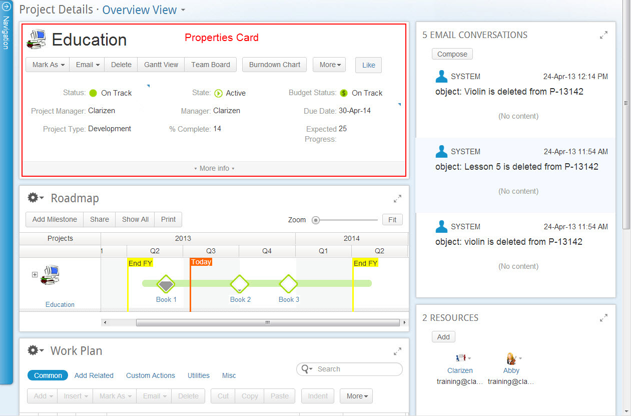
Figure 33: Project Detail View
About Item Detail Views
Item Detail views are comprised of an item's Properties Card at the top of the page and panels containing any related items, such as resources, followers, discussions, emails and more.
Specific information is displayed in the customizable panels that can be arranged in the view to suit your needs. Some items in an Item Detail view use special panels.
Just like with Module views, you can work with items in each panel directly without losing context of the project.
Item Detail view panels within the view can be laid out in one or two columns on the screen, and are fully customizable by your organization's Clarizen Admin user. You can further customize the view for private use at the user level.
Expanding Panels
The Properties Card and the panels are expandable.
- Click
 located at the base of a Properties Card to view and edit item properties
 - Click
 located on a panel's upper-right section to populate the entire screen with that panel
 - Click
 to retract the panel to its regular viewing size
Docking Panels
Panels can be docked in order to create views geared towards specific needs and to give you clear visibility into only the most important items.
For example, you might create a project highlight view that only needs to display the roadmap, related cases, expense sheets, and discussions. This can easily be done by docking the unnecessary panels, such as the work plan, followers, emails, etc.
- Click
 located on a panel's upper-right section to minimize the panel (Figures 34)
Figure 34: Docking a Panel - Once a panel is docked, it can be seen below the properties card in the panel holding area (Figure 35)
Figure 35: Panel Holding Area - Click
 to maximize the panel back into its original location
 - Click on the minimized panel to expand it and view all the details
- The panel holding area can also be hidden by clicking
 (Figure 36)
Figure 36: Hiding Panel Holding Area
About Data Previews
Data previews are available in Item Detail views for thumbnails and grid relation fields (such as resources or dependencies)
Hovering the mouse pointer over an item name in the above locations exposes the  Quick Peek.
Clicking it opens a data preview window while staying in context of the current item view.
About Special Panels
Some items in an Item Detail view include the following special panels:
Work Plan Panel
Work item 'Item Detail' views include the Work Plan panel which provides a clear, easy to follow view of work items broken down into sub-items in a tree format. In project management terminology, this is a WBS, a work breakdown structure.
The Work Plan Panel shows all the project's work items. The panel's default columns are specifically chosen for logical work plan tracking. The ribbon provides all possible action options, and a Contextual Search Advanced Filter , located on the upper right-hand side, enables searching for grid items.
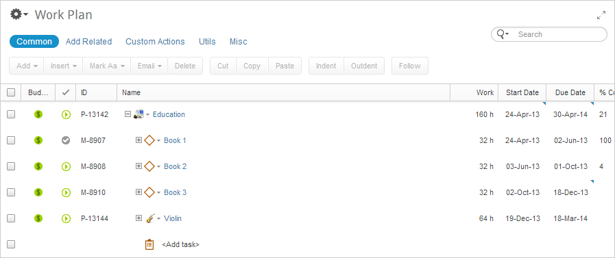
Figure 37: Work Plan
Roadmap Panel
Project Item Detail views include the Roadmap panel, Clarizen's unique bird's-eye-view of a project's plan.
The Roadmap is an interactive color-coded timeline chart with finish dates reflecting real-time visibility to deliverables from a high level view of a project with its tasks and milestones in progress.
The ribbon provides all possible action options, the zoom control zooms the view.
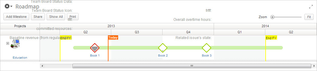
Figure 38: Roadmap
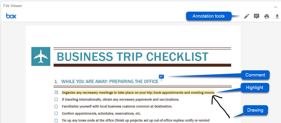
File Viewer
Clarizen enables you to upload files of any type, to a work item and to most other items.
File Item Detail views include a File Viewer, an embedded viewer for uploaded files to Clarizen with annotation options.
The File Viewer
This page describes the File Viewer and includes the following sections:
- About the File Viewer
- Expanding Panels
- Paging
- Zooming Views
- Adding Comments
- Replying to Comments
- Highlighting Text
- Deleting Comments
- Downloading Files
About the File Viewer
The File Viewer offers two types of annotations:
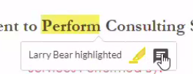
- Comments - Allows selecting an area in a file, and adding a text comment. Multiple comments can be added and viewed by multiple users.
- Highlights - Allows placing a transparent yellow overlay on selected text, and adding a text comment to the highlight.
- Drawing - Allows free drawing over the document.
Additional features include options to print the file, and to download the file from within the viewer.
As with Item Detail views, the File Viewer layout is a customizable; a series of panels can be displayed in either one or two panel columns, and the panel locations within the columns are customizable by clicking and dragging.
Expanding Panels
Each File View panel (except the Properties Card) includes an Expand Panel control to enable filling the entire screen with that File View panel.
- Click
 to expand the panel.
 - Click
 to return the panel to its original size.
Paging
When a file has more than one page, the first file page is displayed.
Click the arrow controls to page the file back or forth.

Zooming Views
- Click the
 zoom controls to zoom a file.
Adding Comments
To add a comment:
- Click on the comment icon in the top-right corner of the viewer.

- Click where you want to add your comment.
- Type in your comment and click Post.
Replying to Comments
- Click on any existing comment to add additional comments/replies.
Highlighting Text
- Select the text you want to highlight, and select the highlight tool.
- You can optionally add a comment to the highlighted text by clicking on the comment icon.
Deleting Comments
- Select the comment and click the bin icon.
- Click Delete to confirm the deletion.
Downloading Files
- Click the download icon in the top-right corner of the viewer.
Note: The file will be downloaded without annotations.
Managing Views
Ribbon and Contextual Menu
This page describes the Clarizen ribbon and the Contextual menu, and includes the following sections:
- About Ribbons
- Using Ribbon Controls
- About Contextual Menus
- Using Contextual Menus
- Examples of Contextual Menus
About Ribbons
Clarizen ribbons are located under the masthead (at the top-left) of most grid displays, in Item Detail view Properties Cards and other specific Item Detail view panels, such as the Work Plan.
Ribbons, which are categorized as necessary in some locations, have controls (buttons) to enable performing actions on selected items.
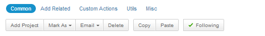
Figure 41: Ribbon
Categorized ribbons are grouped into the following categories:
Certain modules have ribbon categories suited for that specific module item type, such as Common , Add Related or Custom Actions , whereas other modules include the entire range.
The Common category is available in every module with a defined role, such as the Work Items, Cases, Expense Sheets or Timesheets modules.
Ribbon buttons in each category are determined and labeled by the relevant control actions for the module/panel item type and the currently selected item. Only certain ribbon control buttons become active when items are multi-selected.
Ribbon buttons to add item types to a selected item in the grid are labeled according to module item type.
For example, in the Tasks module, the button is labeled Add Task , in the User Groups module the button is labeled Add User Group, whereas for the Expense Sheets module, it's Add Expense Sheet. The resulting action windows are similarly- labeled, and window options and controls therein are matched and suited accordingly.
Some modules do not include a ribbon and have stand-alone action buttons, whereas Item Detail view Properties Cards have non- categorized ribbons consisting of action buttons.

Figure 42: Item Details Properties Card Ribbon
Using Ribbon Controls
After first selecting an item in the grid or other location, click the ribbon category (when relevant), and/or the relevant action button.

The range of Common controls is specifically designed for common recurring actions performed on items, depending on item type and a user permissions:
Add — add new items.
Depending on where you are in the system, this control may be a drop-down menu, for example, in Work Items module or a project Item Detail view.
Insert — available only in the Work Plan module, enables inserting new items above a selected item.
Mark — enables editing the current state of selected items.
Email — enables users to email team members.
Note:
The Send vCard control option is only provided when InterAct is available and only for groups, work items and cases.
The Send Update Request option is only available for work items.
Delete — enables deleting items. Some items are relocated to the Recycle Bin.
Cut — cuts selected items. Shortcut keys: ‘Ctrl x’.
Copy — copies selected items. Shortcut keys: ‘Ctrl c’.
Paste — pastes selected items. Shortcut keys: ‘Ctrl v’.
Indent — Shifts right selected items and item types. (Shortcut keys: 'Alt+Shift+ right arrow')
Outdent — Shifts left selected items and item types. ( Shortcut keys: 'Alt+Shift+ left arrow')
Expand — expands selected items and item types.
Collapse — collapses selected items and item types.
Note:
The Indent , Outdent, Expand and Collapse controls are only available in Work Plan.
Follow — enables following a selected item for viewing updates in the News Feed.

Add Related controls are for adding related items to selected items (such as adding a resource to a task or a milestone to a project), which are then displayed in the Relations Panel. Users can determine the items’ relations in the Layout Manager.

Custom Action controls enable running Custom Actions on selected items.

Utility controls are provided to enable running additional actions, such as opening special views, starting a stopwatch, viewing a Gantt view, etc.

The miscellaneous system controls for Clarizen system actions:
Export — Enables exporting an entire grid of items (XML format for Data Loader support and Excel format) that is, the entire view range, not just the grid in view.
Print — Prints the current page.
Move — enables defining an item as the parent of another item.
Note:
The Move control is only available for work items.
Change Type — enables Users to change an item type from one item type to another item type.
Note:
The Change Type control is only available for work items and cases.
Roadmap Visibility — enables determining if a selected item is displayed in the Roadmap.

Administration controls in the People module enable managing, inviting, editing, deleting, revoking and restoring Clarizen users and user licenses.
Adding New Items
- Click

The relative Add New window opens.
Note:
A dd buttons are labeled according to module item type.
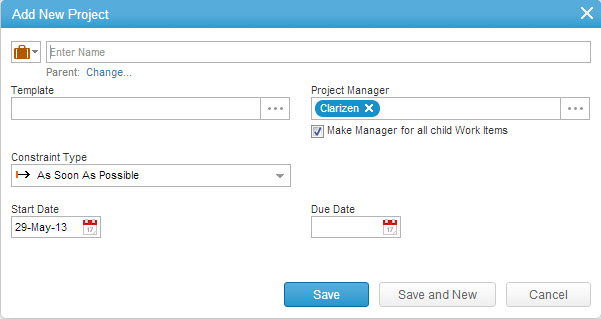
Figure 43: Add New Window
Note:
Windows and dialog boxes and the actions and controls available are suited according to item type.
- Configure as necessary.
- Click

The new item is added.
OR- Click
 to save the addition and open another Add New window.
- Click
About Contextual Menus
Clarizen Contextual Menus are drop-down menus accessed by clicking  located adjacent to icons within grid and thumbnail displays and Relations Panels. The menus provide sets of rudimentary actions that can be performed on the selected item, and access to the item’s Properties Card.
Using a Contextual Menu
The following steps focus on an example of a project contextual menu.
- Click
 adjacent to the icon.
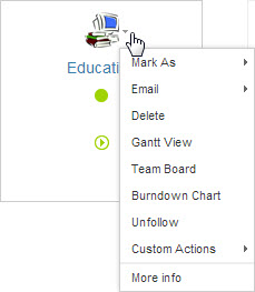
Figure 44: Project Contextual Menu - Select an action from the menu:
- Mark As — Options to mark the project as:
- Draft
- Active
- On Hold
- Canceled
- Complete
- Read
- Unread
- Email — Options to send an email to:
- The team
- Managers
- Resources
- Reviewers
- Send a vCard
- Email to... (customize)
- Send Update Request
- Delete — D eletes the selected project
- Gantt View — Opens a project's Gantt view
- Burndown Chart — Opens a burndown c hart ( graphical representation of work left to do versus time)
- Follow — Follows the project
- Custom Actions — Lists the project's defined custom actions such as
- Uncommit Resources
- Find and Replace Manager
- Delete Children
- More Info — O pens the project Properties Card
Note:
You can change work item names and icons directly from within the related Properties Card.
- Mark As — Options to mark the project as:
Examples of Contextual Menus
Contextual menu actions and functions are relevant to the current module and dependent on the selected item.
Figure 45: People Menu
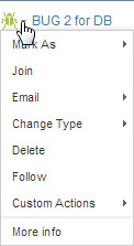
Figure 46: Bugs Menu
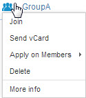
Figure 47: User Groups Menu

Figure 48: Skills Menu
Column Sets
Column Sets
This page describes column sets in Clarizen and includes the following sections:
- About Column Sets
- Adding and Removing Columns
- Formatting
- Resizing Columns
- Reordering Columns
- Wrapping Column Titles
- Freeze Columns
About Column Sets
Clarizen enables adding and removing grid columns, sorting and resizing columns, as well as display and conditional formatting, providing several options to choose the optimal way of absorbing information in a view.
You can then save the 'personalized' view for future use (on top of the existing view).
Only you can see the personalized view with your defined settings unless shared with others.
Adding and Removing Columns
Note:
Columns in the grid can be formatted to display either text, icons, or both.
- Click
 located right of the closed Navigation Panel

The settings menu drops down
- From the menu, under COLUMNS, select Manage
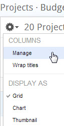
The Choose Fields multi-find window opens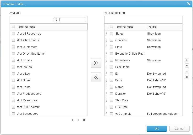
- Configure as necessary:
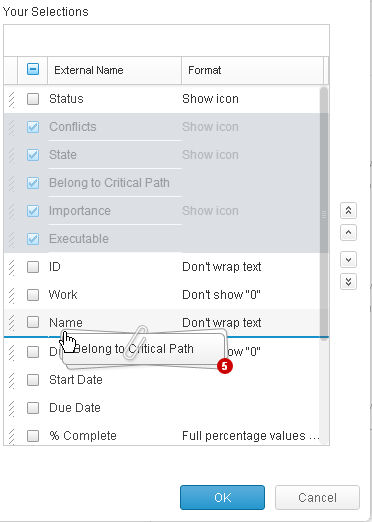
- Add or remove columns to the Your Selections column:
Click or
or 
- Browse for column options:
Click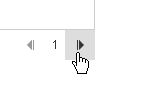
- Sort the column order:
Check one or more column items in Your Selections and click the
  location arrows
- Add or remove columns to the Your Selections column:
- Define column formats as necessary
- Click

Columns in the grid are added/removed
 column items and hover the mouse pointer over the
  of column type(s)
Formatting
The data shown in each column can be formatted based on the type of data shown as detailed ahead in format types.
In addition Clarizen allows you to apply conditional formatting of all field types in Reporting and Views.
These two features increases usability and visibility of important information for all users.
Defining Column Format
The column format defines the way the data will be displayed for each column.
Note:
The available column format options are based on the column field type.
To define the column format:
- Access the column Choose Fields find window
You can also access the formatting directly from the list (grid) header. Click the down arrow for any item and choose the format option.
- Click on the text in the Format field column — under Your Selections
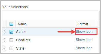
The format text for the field is selected
The Conditional Formatting dialog opens. The current column format is shown under the Display heading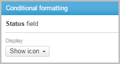
- Click the Display menu
The Display format pick list drops down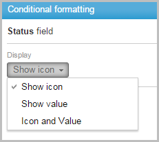
- Select a format
The selection is shown in the Display section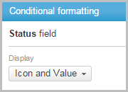
- Depending on the selected display, you may apply Conditional formatting
- Click

The column is formatted - Click
 to close the Choose Fields multi-find window
Formatting Types
Each column entity type has different formatting options.
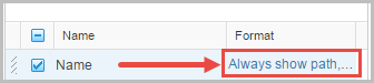
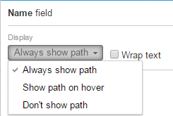
Path
Displayed items that have a path (such as work items) have formatting options for selecting whether or not to show the path, seeing it only when hovering the mouse pointer, or never seeing it.
The last two options reduces the row height to the one line, showing less 'padding' and more rows.
Icon
Displayed items that have an Icon available can be displayed showing only the icon, showing the value, or showing both the icon and value.
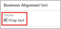
Text
Data fields containing text can be defined to wrap the text.
Click the checkbox next to Wrap text so that text wraps to multiple lines or uncheck so the text stays on one line
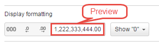
Numeric
Numeric Field Formatting allows you to personalize the numeric display in all views according to your preferences while maintaining data integrity and includes several formatting options, changes made are shown in the preview field.
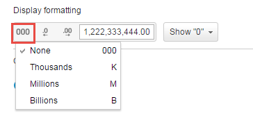
Display Unit
Define the display unit in order to round numbers for numeric abbreviations in K (Thousands), M (Millions), B (Billions) to better understand the value of long numbers.
Click the Display unit icon to open the list of available options.
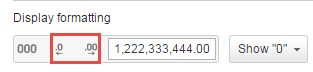
Decimal Place
Increase or decrease the decimal places for precise numerical values
Click the Decrease and Increase Decimal Place icons to change the number of digits displayed after the decimal point
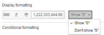
Show "0"
Numeric data fields can be defined to either show the number zero (0) when applicable or leave the field empty in such a case
%complete
The %complete field type is unique and has several display options:
- Done toggle - displays a toggle switch which can be used to mark tasks as complete
- Full percentage values (do not show '0') - displays the complete numeric value, leaving it empty if it equals zero (0)
- Full percentage values (show '0') - displays the complete numeric value including zero (0)
- Bar - displays a progress bar

None
Some field types, such as date fields, have no direct formatting options but can still be accessed to utilize conditional formatting
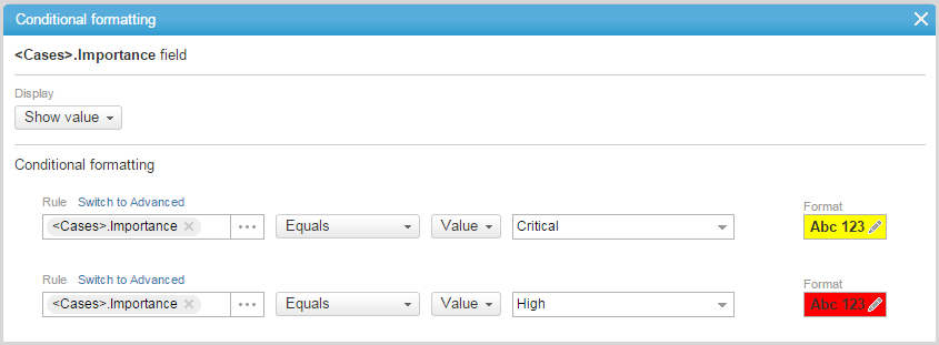
Conditional Formatting
Conditional formatting allows you to set the text color, background color, font face, and font style, as well as utilize advanced custom CSS, on any cell in your report or view, based on a set of basic or advanced conditions and rules.
The conditional formatting option can be employed to to see important information at a glance, differentiate between distinct metrics, as well as highlight data for clearer business value when sharing a report with your customers.
With conditional formatting the project manager can perform smarter in depth analysis of the project, tasks and resources. This enables improved decision making processes, and productive meeting discussions of next steps regarding project problem areas and lessons learned.
Conditional Formatting Rules
Conditional formatting of a field and/or value is comprised of a set of ordered rules that can be configured in both view and instance level.
Rules can be added, deleted, reordered, and updated. Each rule must contain a condition and a result.
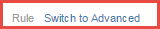
You can choose Simple ruling, which uses field names, values and drop down menus to format text, or Advanced ruling, which enables you to write your own formulas and use custom CSS
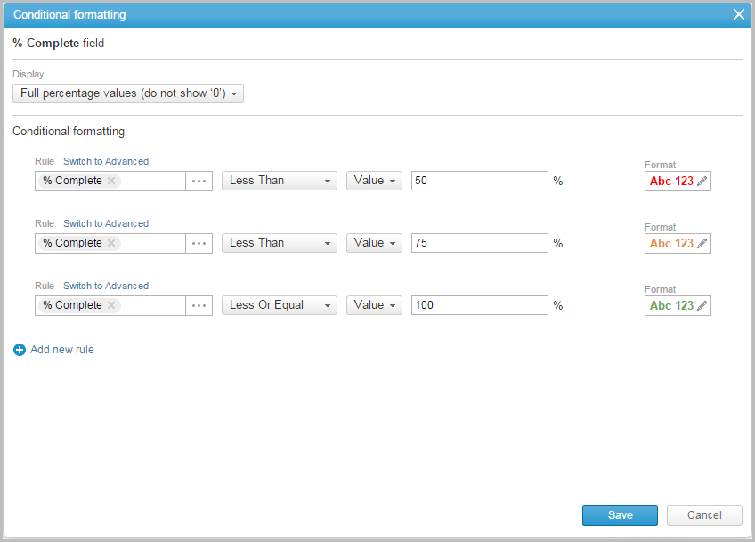
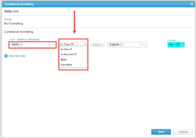
To create a new Simple conditional formatting rule:
- Access the column Choose Fields find window
- Click on the text in the Format field column — under Your Selections
- Click on Add new Rule to add a new simple rule
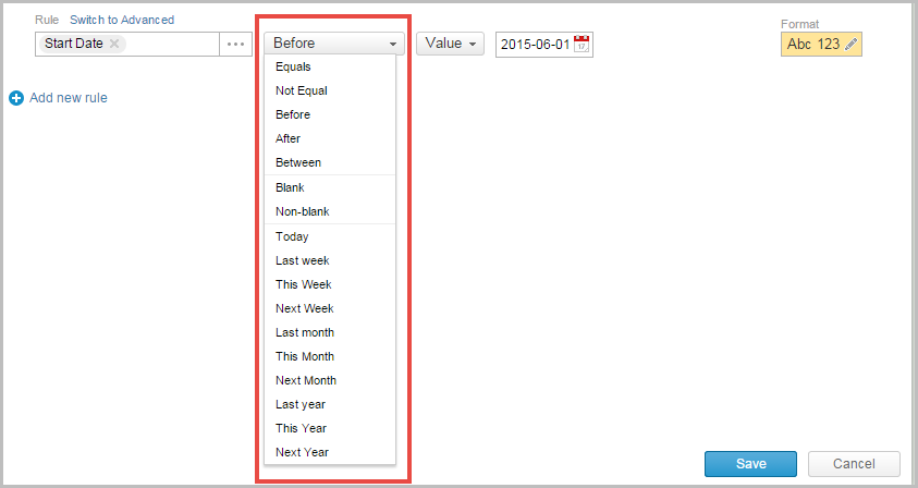
The Rule field already contains the field name you selected in step 2 - Select the rule conditions using the available menus and text boxes
When comparing fields ensure that they are the same field type such as numeric, date or currency fields.- If comparing dates select an item from the related operators (more than, less than, equals, etc.) drop down list
- If comparing numerical values such as Actual Cost the relational operators such as more than, less than, etc. may change slightly
- Depending on the Field you choose the relational operators may change
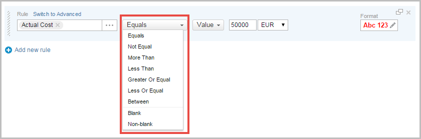
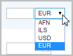
- After selecting a relational operator, choose a Value or field. If it is a cost value then you will need to choose the currency that applies to your project.
- If comparing dates select an item from the related operators (more than, less than, equals, etc.) drop down list
- Apply formatting:
Click on ABC 123 to format the rule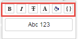
You can:- Click
 to make the text Bold
 - Click
 to make the text Italic
 - Click
 to apply
 Strike-Through - Click
 to change the font color, click
  to change the background color
Select a color from the color picker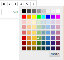
Or click to open the custom color palette
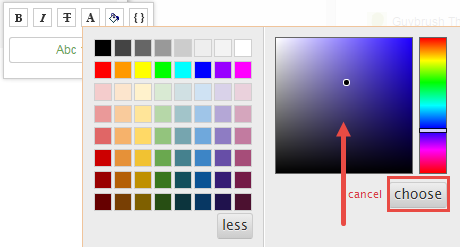
- Click
 to associate with a CSS class
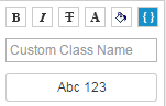
- Click
- Repeat steps 3-5 to create additional rules
- Click

- Click
 to close the Choose Fields multi-find window
Advanced Rule
Advanced rules employ Clarizen's full customization capabilities.
To create advanced rules:
- Follow steps 1 - 3 above in the Basic Rule instructions to create a new conditional rule
- Click on
 to allow advanced ruling
 - Create the rule you wish to employ
You can use the Formula Options and Check Syntax links to assist you in the creation of the rule - Apply formatting as explained in Step 5 above in the Basic Rule instructions
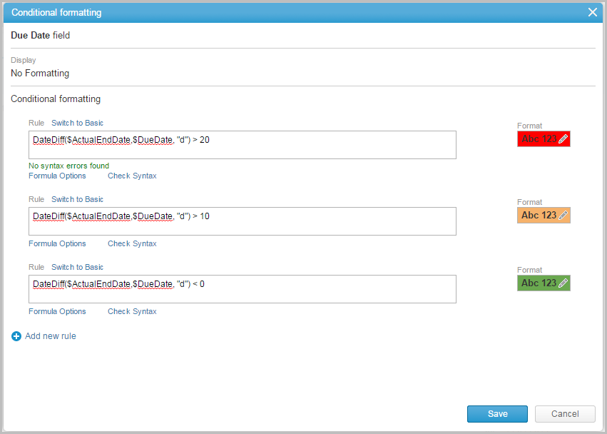
- Repeat steps 3 and 4 to create additional rules
- Click

- Click
 to close the Choose Fields multi-find window
Below are two examples of conditional formatting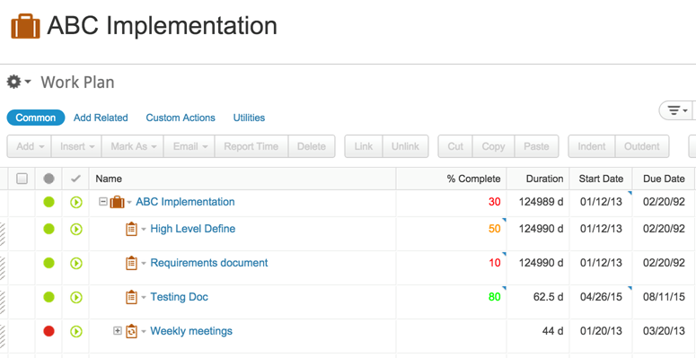
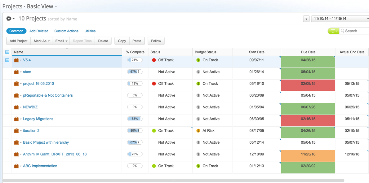
Relation Panels and Items
Conditional Formatting allows for key exception management by allowing you to focus on items that require your attention. Conditional Formatting is now available in the related panels, and allows you to define rules based on related items. This gives users the flexibility to quickly spot important related items such as total time worked at the project level or to quickly view critical open cases on projects.
To create conditional formatting on Relation Panels:
- Go to the Navigation Bar, click on Projects or another Module View
- Add or edit Relations Panels
- Click on the current view and click Edit View
- In the View Editor click on a Relations Panel
- Choose to view the Relations Panel either as a Thumbnail or Grid view
- Note for Thumbnail view only 5 fields will be shown
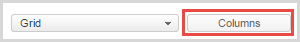
- Click on Columns
- The Choose Fields window is displayed
- The Panel mode can be changed from Narrow to Wide to increase or decrease real estate for the Related Panels.
- Click on the text in the Format field column — under Your Selections
- Click on Add new Rule to add a new simple rule
- Conditionally format the column after filling out the basic rule
- Click Save
Below is an example of conditional formatting on the Relations Panel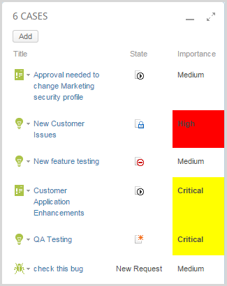
Related Items
Views of Related Items can be conditionally formatted via Manage Columns in Module Views. This provides users with the ability to highlight information such as Resource Skills in the People View or Resources not one of in the Project Views as well as other Module Views.
To Create Conditional Formatting on a Related Item in Module Views:
- From the Navigation Bar click on Projects or another Module View
- Access the column Choose Fields find window
- Select a Related Item such as Skills to conditionally format
Below is an example of conditional formatting on a related item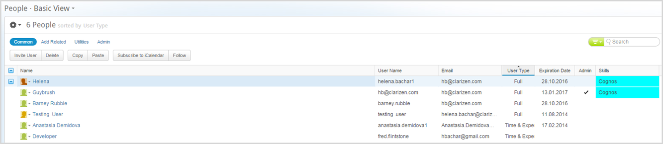
Resizing Columns
- Hover the mouse pointer over a column's side line
The mouse pointer changes to
- Click and drag the column to the desired width size, and release the mouse button
Resized columns maintain altered widths, including after refreshing a browser or logging out of Clarizen.
Notes:
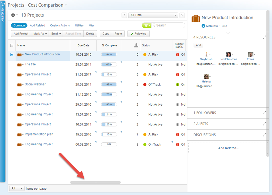
- A horizontal scroll bar is included at the base of the grid when necessary to enable viewing all columns.
- To save column widths for views, whether your personal views or for all users on the Profile level, do the following:
- In the view, resize columns per your requirements.
- Now open the view in the View Editor (personal view or Profile default view).
A popup appears asking whether to import the changes you made in the view. Accept the changes and save the view (or Save As for a new view).
Reordering Columns
- Hover the mouse pointer over a column's heading
- Click and hold the mouse button
The mouse pointer reverts to
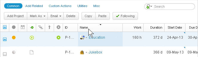
- Drag the column heading to the desired new location
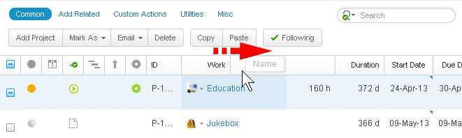
- Release the mouse button
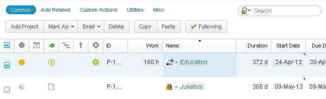
The column position is reordered.
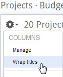
Wrapping Column Titles
You can manage the column title cell size.
- Click
 located right of the closed Navigation Panel
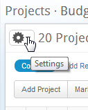
The settings menu drops down. - From the menu, under COLUMNS, select Wrap Titles
Example of wrapped column titles:

Example of non-wrapped column titles:

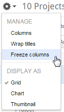
Freeze Columns
For a clear view, you can freeze the Name column so any column to the left of the Name column will remain frozen as you scroll through selected data using the horizontal scroll bar.
The default is to freeze the Name column and (any columns before it) to maintain the context of your work while scrolling through the selected data.
The horizontal scrollbar allows you to scroll left and right to view all of the relevant data columns.
To Freeze/unfreeze the columns:
- Click located right of the closed Navigation Panel
The settings menu drops down. - From the menu, under COLUMNS, select Unfreeze Columns
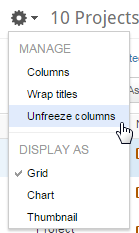
- Restore the column freeze by selecting Freeze Columns, under COLUMNS
Sorting Columns
This page describes sorting grid columns and includes the following sections:
About Sorting Columns
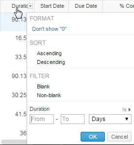
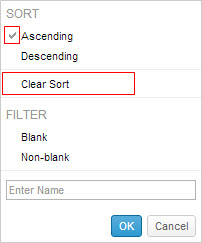
Columns in a grid are sortable — either alphabetically or chronologically (depending on the column field type) — in descending, ascending or 'original' (DEFAULT) order. Column sorting is achieved by clicking column headers or by selecting a sort option from column drop-down menu. For the Work Plan, you must click on the drop-down menu.
Whenever a column is sorted in the grid , any other sorted columns are cleared of sort options and are restored to the default sort order.
Column sorting is contextual meaning that field data shown in columns is relative to the current Advanced Filter settings (when relevant).
Sorting Columns
- Click the column header once (in the Work Plan, click on the drop-down menu).
The column is sorted (alphabetically or chronologically depending on field type) , in descending order.
The indicator appears indicating the column is sorted in ascending order.
 - Click the column header again to sort according to (alphabetical or chronological ) , ascending order.
The column sorts in ascending order. The indicator appears in the column header indicating that the column is sorted in descending order.
 - Click the column header again to restore the column sort to original order.
- Hover the mouse pointer over a column header and click
 in the cell's right to open the column drop-down menu .
- Click an unselected sort option in th e menu.
The column is sorted by the option.
The menu updates accordingly.
A checkmark appears adjacent to the selected sort option , and the Clear Sort option appears.
Other sorted columns are cleared of sort options and are restored to the default sort order.
Figure 50: Column Drop-Down Menu
Clearing Sort Options
- Hover the mouse pointer over a column header and click
 in the cell's right.
The column menu drops down. - Click Clear Sort.
The column is restored to the default sort order.
Display Options
This page describes the Clarizen view display options and includes the following sections:
About Changing Displays
You can change the display of specific views 'on the fly' .
- The Projects module can display projects in a grid, as charts or as thumbnails.
- The Tasks module can display tasks in a grid or as charts.
- The People module can display people using Clarizen in a grid or as thumbnails.
Setting the View Display Type
- Click
 located right of the closed Navigation Panel.
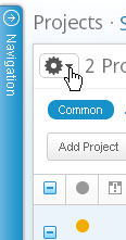
Figure 51: Gear
The settings menu drops down.
- From the Gear menu under DISPLAY AS , select an alternative display option.
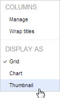
The screen refreshes with the selected display type.
Grids
This section describes grids and includes the following sub-sections:
- About Grids
- Paging
- Selecting Individual Items
- Selecting All Items
- Selecting Multiple Items
- Selecting Individual Item Types
- Selecting Multiple Item Types
About Grids
Grids, available for most Clarizen modules, display a table layout of items and item types listed either on a page or set of pages.
A total of 40 items appear per grid page. Grid type views, which can be searched and filtered and totally customized, provide a tidy and detailed method for managing, and navigating to items.
A ribbon enables performing a host of actions, and items within the grid can be editable.
A Contextual Search is located on the upper right-hand side, and a Time Range Filter (included when relevant) is located above that.
The Relations Panel displays any related items, such as assigned resources, files, and discussions, etc.) of a selected item type in the main panel, and enables working with the related items while staying in context of your original view.
The panel is blank when multiple items or item types are selected.
Note:
When adding relations to a grid, only the first 30 related items are shown in the in the cell.
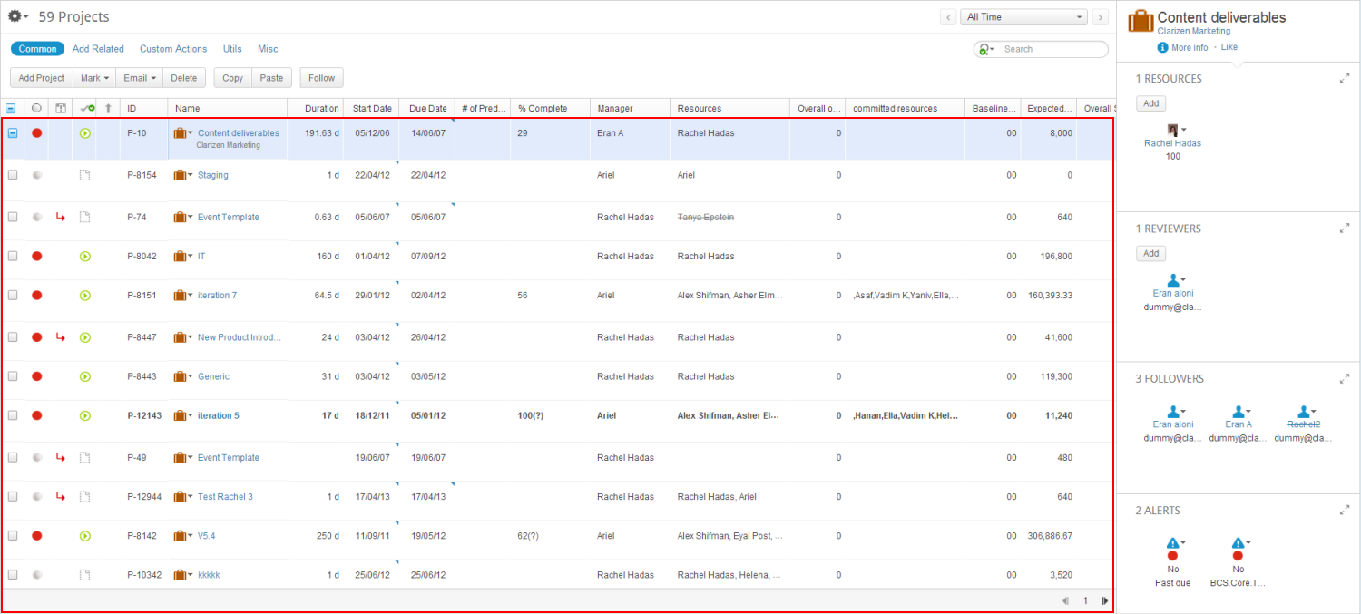
Figure 52: The Grid
Paging
- Click
 or
or  located on the lower-right.
Page numbers update accordingly.
Selecting Individual Items
When a single grid item or item type is selected, the Relations Panel refreshes with the corresponding related item data.
- Click
 located adjacent to an item .
The checkbox becomes  and selected grid item row is highlighted.
- Click
 again to un select the item.
Selecting All Items
- Click

All checkboxes become  and all grid item rows are highlighted.
Click  again to un select all items.
Selecting Multiple Items
To select multiple items in the grid :
- Click two or more
 located adjacent to grid items.
The  becomes
The selected items' checkboxes become  and the item rows are highlighted.
- Click
 twice to un select the i tems .
Selecting Individual Item Types
- Click a item type cell.
The row  becomes
  indicating that the item type’s row is semi-selected, the row is highlighted, and the item type's cell boundary remains highlighted.
- Click
 twice to unselect the item type cell .
Selecting Multiple Item Types
- Click and drag the mouse pointer over two or more item type cells.
The  and all
  located adjacent to those item types' rows become
  indicating that the item type rows are semi-selected, the rows are wholly highlighted, and the selected item type cell boundaries are highlighted.
- Click
 twice to un select the semi-selected item types' rows.
Charts
This section describes charts in Clarizen and includes the following sub-sections:
About Charts
Charts, available for the Projects and Tasks modules, display a graphical representation, in chart form, of projects and tasks based on scheduling status. This view type is a quick way of monitoring information, providing an ' at-a-glance' high level indication of progress status, and enables navigating directly to item types to perform actions.
Financial users see additional graphs of projects and tasks that are based on budgetary health.
A Contextual Search is located on the upper right-hand side, and a Time Range Filter is located above.
Projects Chart View
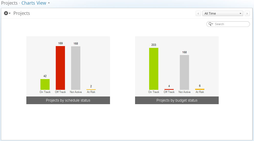
Figure 53: Projects Chart View
- Click a bar in the chart.
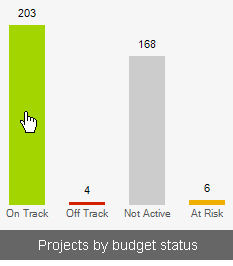
Figure 54: Projects On Track
A grid of work items opens in a separate window.
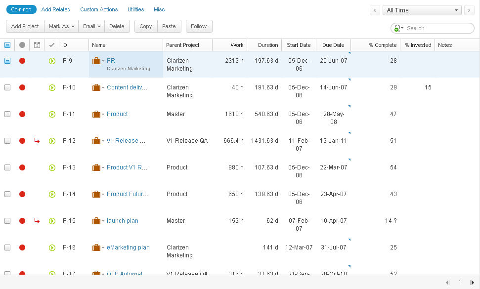
Figure 55: Projects On Track - Grid
The Contextual Search Advanced Filter shows  indicating the filter is on; the view filtered according to the selected (schedule or budget) status. The grid can be totally customized, searched and filtered. The ribbon enables actions, and grid
items can be edited.
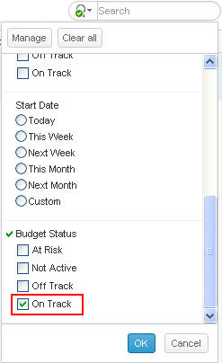
Figure 56: Contextual Filter On Track
Tasks Chart View
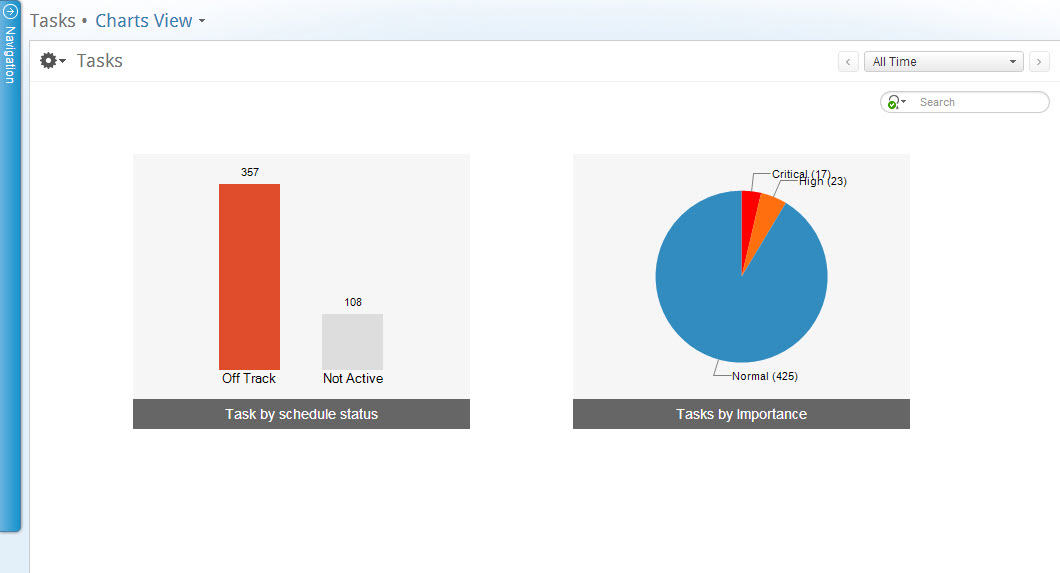
Figure 57: Tasks Chart View
Tasks chart views provides a graphical view of their tasks by status, as well as a pie chart of tasks by importance. Clicking any of the bars or pie slices re-directs to a filtered grid in a separate window.
Thumbnails
This section describes thumbnails and includes the following sub-sections:
- About Thumbnails
- Paging
- Projects Thumbnail Default Layout
- People Thumbnails
- People Thumbnail Default Layout
About Thumbnails
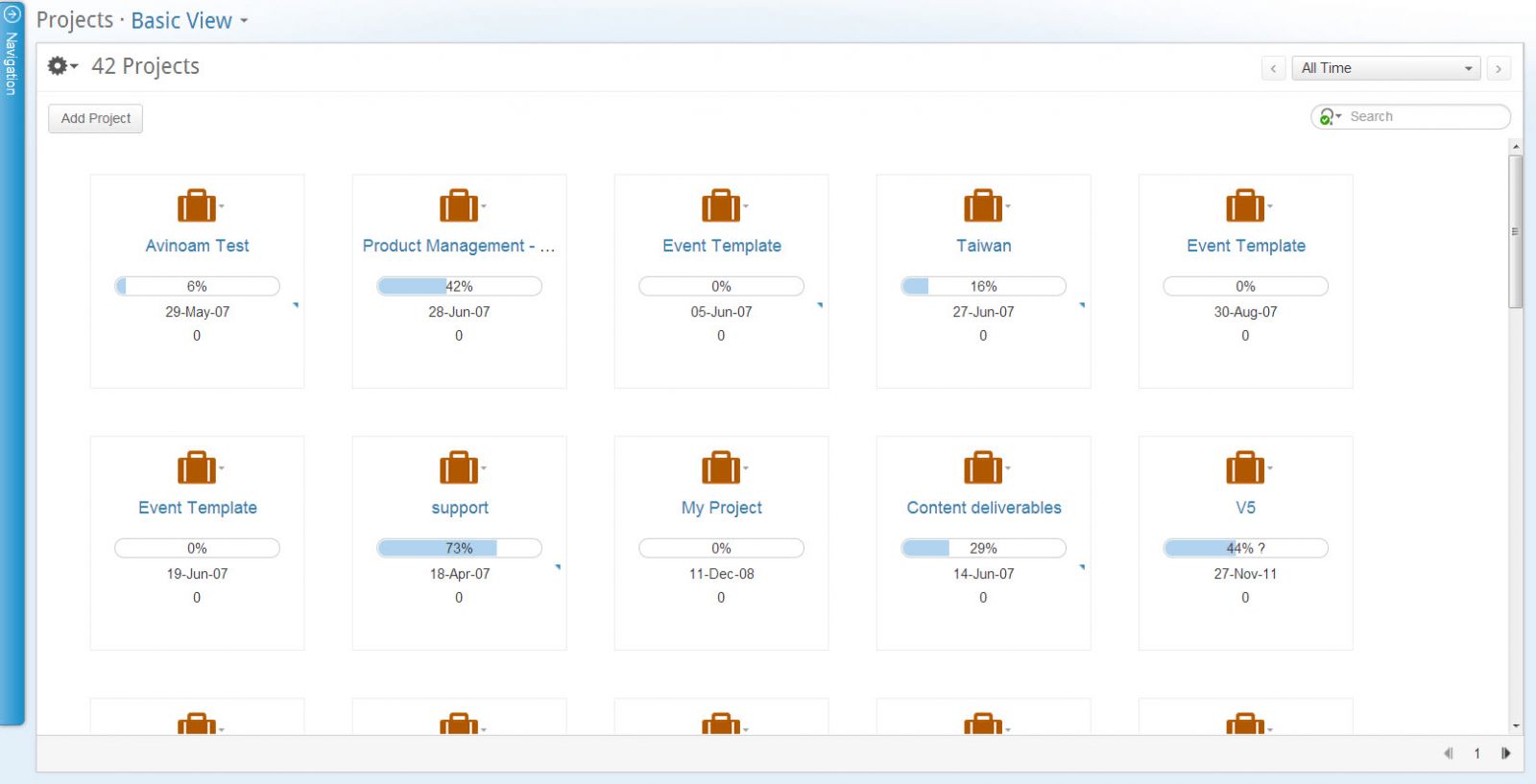
Thumbnails, available for the Projects and People modules, display projects or Clarizen users in your organization as thumbnails, each one with customizable icons and fields. This type of view provides you an at-a-glance method for monitoring information and managing items, and enabling navigation directly to the item to perform actions.
An Add Project/User button, located in the view's upper-left corner, enables creating new projects (in Projects module ) or inviting people to join Clarizen (for People module). A Contextual Search is located on the upper right-hand side of the view and a Time Range Filter is included ( Projects module only) located above.
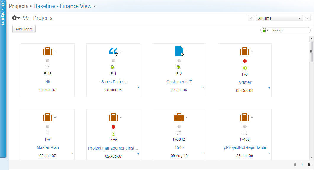
Figure 58: Projects Thumbnails
Paging
- Click
 or
or  located on the lower-right.
Page numbers update accordingly.
Projects Thumbnail Default Layout
In addition to the project name and icon, Clarizen enables you to choose up to five fields to display in the thumbnail.
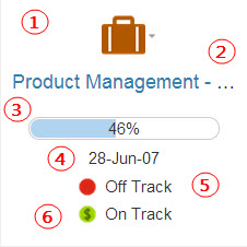
Figure 59: Default Thumbnail

 — Customizable icon and contextual menu.

 — Project name.
- Hover over with the mouse pointer to expose the
 Quick Peek.
 - Click a project name on a thumbnail to navigate to the project's Item Detail View.

 — I ndicates and enables defining the overall % project progress.
To define the progress bar:
- Click th e bar.
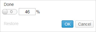
- Click the value field and enter % value
OR
Click
The dialog updates.
- Click

The project progress bar updates.

 — Indicates and enables defining the project due date.
To define due date:
- Click the date.
The calendar opens, the due date is highlighted.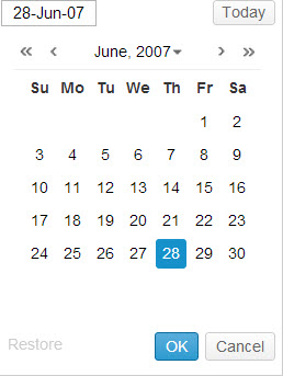
Figure 60: Calendar
- Define as necessary.
- Click

The due date updates.

 — Indicates and enables defining the project's scheduling status.
Status indicators:


- Click the status.
The field becomes active.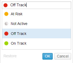
Figure 61: Scheduling Status
- Select the status as necessary.
- Click

The status updates.

 — Available to Financial users only, these icons indicate a project's budgetary status.
Budgetary status indicators:


- Define the budgetary indicators the same way as defining schedule status indicators, above.
Adding Projects
-
Click

The Add New Project window opens.

Figure 62: Add New Project
- Configure as necessary.
- Click

The new project is generated and all people concerned are notified by the system.
OR
Click
The new project is generated, all people concerned are notified by the system, and another Add New Project window opens.
The new project is added to the thumbnails.
People Thumbnails
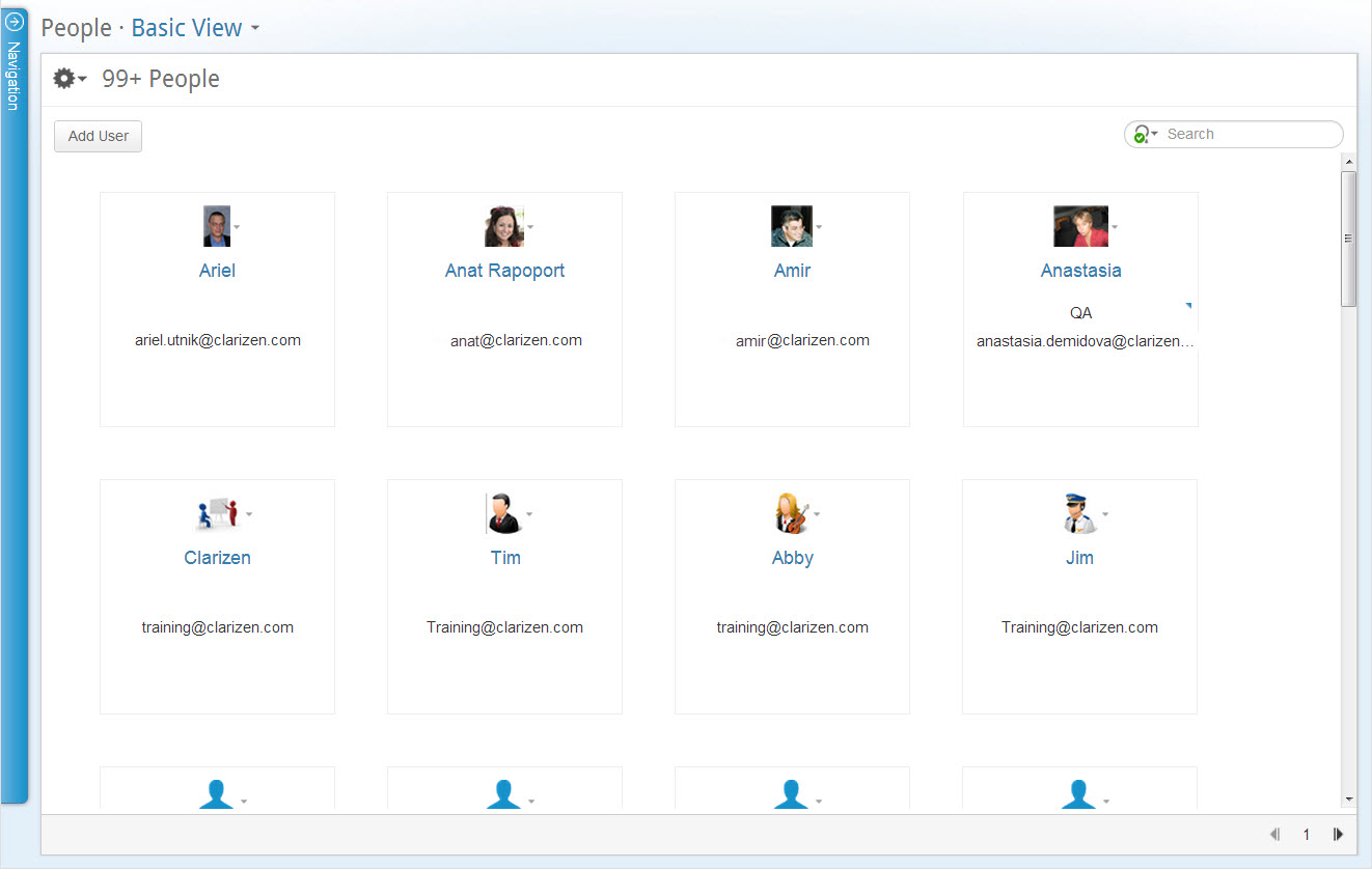
Figure 63: People Thumbnails
People Thumbnail Default Layout
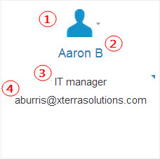
Figure 64: People Thumbnail

 — Customizable icon and contextual menu.

 — User's name.
- Hover over with the mouse pointer to expose the
 Quick Peek.
 - Click a name on a thumbnail to navigate to the user's Item Detail View.

 — I ndicates and enables defining the u ser's job title.
To define the job title:
- Click the area, the Job Title field window opens.
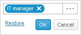
- Click

The Select Job Title find window opens.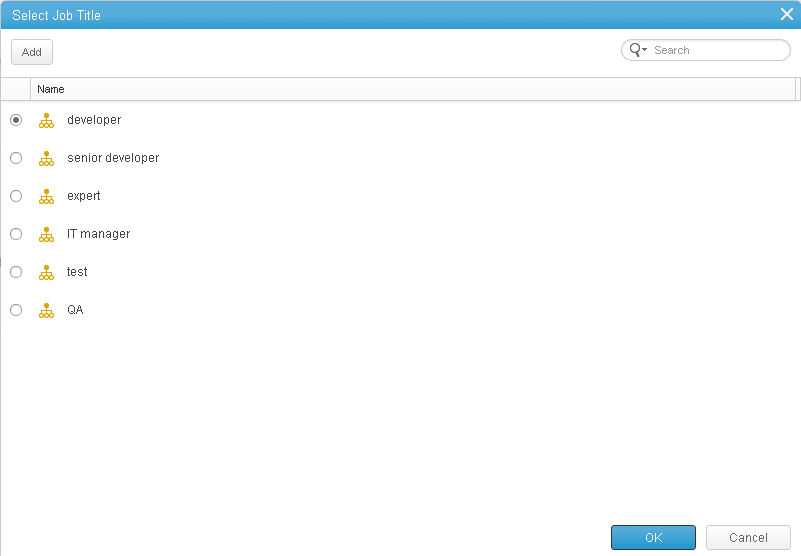
Figure 65: Select Job Title
- Configure as necessary.
OR
- Click

The field becomes blank. 
The Job Title is defined.

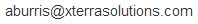 — I ndicates and enables defining the u ser's email address.
To define the email address:
- Click the area, the email field window opens.
- Edit the field.
- Click

The email address is defined.
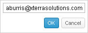
Adding People
Adding people enables using peoples email details to invoke the system to generate email notification invitations for them to join Clarizen.
-
Click

The Add New User window opens.
Figure 66: Add New User Window
- Enter the required persons email address to the field .
- Click

An email is generated and sent to the specified person.
OR
Click
An email is generated and sent to the specified person and a blank Add New User window opens.
Searching And Filtering
This page describes the searching and filtering in Clarizen and includes the following sections:
- Searching Clarizen Globally
- Searching in Context
- Filtering by Time Range
- Filtering by Column
- Clearing Filters
- Saving Filtered View as Default
- Reverting Views
Searching Clarizen Globally
This section describes searching Clarizen using the Global Search and includes the following sub-sections:
- About Searching Clarizen Globally
- Using the Global Search
- About Global Search Results
- Using Global Search Results
Note: Due to technical limitations, the following special characters cannot be used in the global and quick search.
The characters are *?%[]{}!=:().,;
About Searching Clarizen Globally

Figure 67: Global Search
The Global Search, located at the top of the Navigation Panel, provides the ability to search for items across the entire system.
The initial search matches the text as it is typed in the Global Search field with the IDs and Names of all the objects accessible to the user within the system and generates a “Quick Results” list.
A subsequent search to “Show All Results” can then be initiated either by clicking on the “Show All Results” link or pressing the “Enter” key. This matches the same text entered for the “Quick Results” search, but across a wider collection of fields (ID, Name, Description, Overview and any other configured “Searchable” custom text field). The results are displayed in a new page called “Search Results”.
Using the Global Search
- Enter a search query in the Global Search field.
- Items retrieved by the system populate the panel below the Global Search as links to the items' Item Detail view.
Tip: The full title of retrieved items is displayed when hovering over item links with the mouse pointer.
- Click a retrieved item link from the panel below.
The item opens in Item Detail view.
OR
- Click Show all results located at the bottom of the panel
OR - Press ENTER on the keyboard
The Search Results opens
About Global Search Results
The Search Results displays the found item types listed with the relevant icons in the left-hand panel, and the items displayed in the main panel. The All item type is highlighted, indicating that the option is selected (DEFAULT), and value indicates the amount of items of that item type found. The grid lists all items found and includes information on the item's creator and the date the item was created on. Selecting a different item type from the item type list updates the grid with the relevant list of items.
Using Global Search Results
Search results enable to navigate directly to an item's Detail view from the grid to view the item's data.
- Select the search results item type category ( All or an individual item type) in the Search Results left-hand panel.
- Click an item in the grid.
The view updates to the item's Item Detail view.
Searching in Context
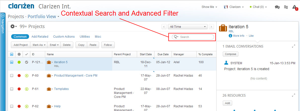
This section describes searching in context and includes the following sub-sections:
About the Contextual Search and Advanced Filter
The Contextual Search enables searching items in the context of the current view. An array of advanced filters on the Advanced Filter menu adjoined to the Contextual Search enables you to include specific data to the current view, such as
work item current states, the item level to display, resource roles, risk and tracking status, and work item schedule dates.
Once filters are defined for the view, the view can be saved as a default for a specific view.
Configuring Filter Options
- Click

The Advanced Filter menu drops down.
Figure 70: Advanced Filter Menu
- Use the scroll bar to view the entire array of current filters.
- Click

The Choose Fields multi-find window opens.
Figure 71: Choose Fields
- Configure Advanced filters as necessary.
Add or remove filters to the Your Selections column:
- Click
 or
or 
Browse for filter options:
- Click

Sort the filter order:
- Check one or more
 filter options in Your Selections and click the
  location arrows.
- Alternatively , check one or more
 filter options and hover the mouse pointer over the
  of filter type(s) .
The mouse pointer changes to
- Click and drag the filter(s) to the required location.
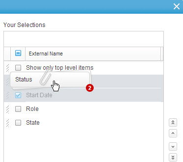
Figure 72: Click and Drag Filters
- Click

Advanced Search filters are configured. The view updates accordingly.
Setting Filters
- Click
 on the Contextual Search Advanced Filter.
The Advanced Filter menu drops down. - Scroll with the scroll bar to view the entire array of filters.
- Set filter options as necessary. Click

- The filters are set, the Advanced Filter icon refreshes to
 (indicating filters are set).
The view updates filtered accordingly.
Filtering by Time Range
This sub-section describes the Time Range Filter and includes the following sub-sections:
Using the Time Range Filter
Filters can be set at the column level or via the Time Range Filter. Changes made to one automatically synchronizes to the other.
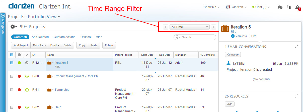
Figure 73: Time Range Filter
The Time Range filter (located top right of the ribbon) enables filtering views to show events occurring during the actual period/date(s) defined.
Filter settings are maintained (remembered by the system) when switching between modules.
Example: Searching Tasks.
- Click

The Navigation Panel opens. - Select Tasks.
The Tasks module opens.
- Click
 on the Time Range Filter.
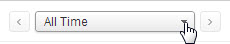
The Time Range Filter options menu drops down. - Select This Week .
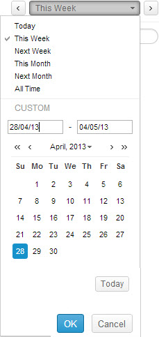
Figure 74: Open Time Range Filter
The Time Range Filter menu closes. The Filter icon is highlighted.
The current view refreshes to include any tasks that concern you within that week's range.
In other words, the tasks concerning you, either as a manager or as a resource, that either start before or during this week, or are planned to end after or during this week.
Changing Time Range Period
The arrows located either side of the Time Range Filter enable changing the time range period according to the current setting.
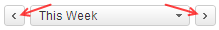
If This Week is selected, clicking the arrows moves forwards or backwards in lots of weeks at a time (1 per click).
If specific Time Range Filter dates are defined using the menu's calendar, each arrow click ( forwards or backwards) defines the time period for items appearing in the view by an equal time range of the dates defined.
Example:
If the 3rd of the month until the 10th of the month is specifically defined on the Time Range Filter calendar (under Custom ), a range of 8 days is defined.
Therefore changing the time period by clicking the arrows takes you forwards (or backwards) 8 days per click.
Filtering by Column
This section describes searching columns and includes the following sub-sections:
About Filtering by Columns
Filters can be set at the column level or via the Time Range Filter. Changes made to one automatically synchronizes to the other. Available column filter options are relative to column field types.
Filters added to columns must be manually saved in order to be retained.
Set Column Filter
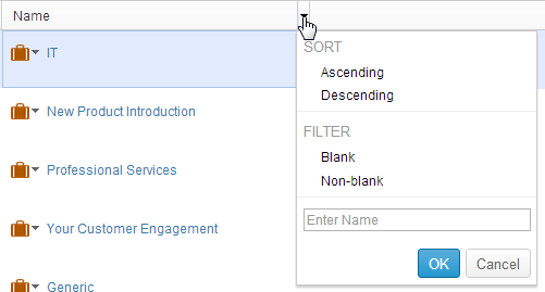
- Hover the mouse pointer over a column header and click
 located on the cells right.
The column menu drops down.
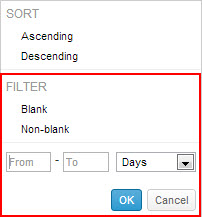
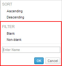
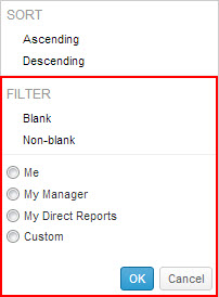
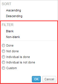
Figure 75: Column Menu Options
- Select Blank or Non-blank :
- Blank
- Non-blank
- The column menu closes. The screen updates filtered accordingly.
- Select filters as necessary.
- Click

The view updates filtered accordingly.
The column  is replaced with
  to indicate that Advanced Filters are applied to the column.
The Advanced Filter icon refreshes to  (indicating filters are set).
Clearing Filters
Clearing Specific Filters
- Click
 on the Contextual Search Advanced Filter.
The Advanced Filter menu drops down.
- Use the scroll bar to view the entire array of advanced filters.
- Uncheck the selected filter options as necessary.
- Click

The specific filters are cleared. The view updates accordingly.
Clearing a Filter Category
- Click
 on the Contextual Search Advanced Filter.
The Advanced Filter menu drops down. - Position the mouse pointer in the pane of the filters category to clear.
The Clear link appears. - Click the link.
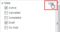
- Click

The filters category clears. The view updates accordingly.
Clearing All Search Filters
- Click
 on the Contextual Search Advanced Filter.
The Advanced Filter menu drops down. - Click

- Click

All filters are cleared. The Contextual Search filter icon refreshes to indicating all filters are cleared.
Saving Filtered View as Default
Once filters are defined a the view, the view can be saved as a default for a specific view from either the Advanced Filter menu or the View Navigator.
- Click

The Advanced Filter menu drops down. - Check
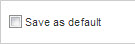
- Click

The filter options are saved as defaults for the specific view.
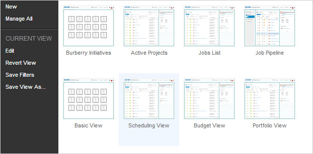
Figure 76: Save Filters - View Navigator
- Click Save Filters .
A pop-up message confirming the action opens momentarily and then closes.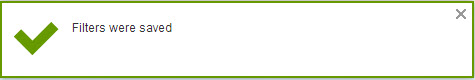
The filter options are saved as defaults for the specific view.
Reverting Views
This section describes reverting views and includes the following sub-sections:
About Reverting Views
Reverting the views reverts altered views to the original system settings or, when relevant, administration-customized default view settings. Reverting the view is done via the View Navigator. The View Navigator's Revert menu option is grayed
out (inactive) unless changes are made to a system or administration-customized view.
Reverting the View

Figure 77: Revert View - View Navigator
- Click Revert View .
A pop-up window prompts to confirm the action.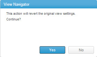
- Click

A pop-up message confirming the action opens momentarily and then closes.
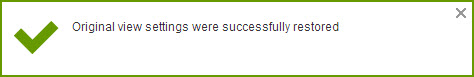
The current view reverts to original system settings or administration-customized default view settings.
Editing Grid Data
This page describes editing items in a grid.
Editable grid items or item types are indicated as such by a grid cell boundary becoming highlighted when hovering the mouse pointer over a grid cell. When a grid cell is not editable, the  icon appears in the cell's upper-right corner.
When a grid Item/Item Type's cell contains a hyperlink, the  icon appears indicating there are editable fields (and an un-editable hyperlink). Editable grid items or item types have various editable field types, including fields that can
receive data typed in directly, drop-down lists with selectable data, combinations of single and multi-find windows, calendar charts, other pick-list types and fields providing  switch controls and
  buttons.
Editing within a Grid
- Double-click a grid cell.
OR
Hover the mouse pointer over an icon and click.
The cell's editable field becomes active. - Click

- Edit the field(s) as necessary.
- Click

The grid item or item type is edited.
Working With Find Windows
This page describes the Clarizen 'find' windows, and includes the following sections:
- About Find Windows
- Adding Items
- Searching a Find Window
- Paging a Find Window
- Column Sorting and Filtering
- Setting Dates
- Selecting Single Find Window Items
- Configuring Multi-Find Windows
- Formatting
About Find Windows
Clarizen's f ind windows are frequently used for configuring several system components and feature within the system.
There are two types of find windows:
- Multi-find windows
- Single find windows
Find windows are accessed from various locations within Clarizen for configuring Module views and Item Detail views, data sets, groups, columns and more.
This section describes in general terms how to use the find windows, for which the functionality of both types is similar, whereas the columns, fields, the resulting dialog boxes, control content and the window titles are relative to the
specific configuration requirements accordingly.
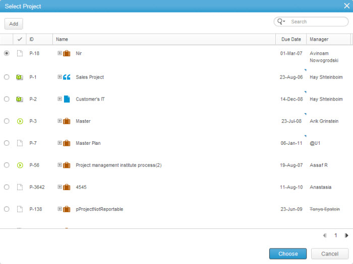
Figure 78: Single Find Window
Adding Items
The find A dd windows vary in configuration options and are dependent on the item or item type being added.
- Click

The relative Add dialog box opens. - Configure as necessary.
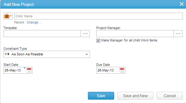
Figure 79: Add New Project Dialog Box
- Click

The Add dialog closes. The item or item type is added to the find window list.
OR
- Click

The i tem or i tem type is added to the find window list. The Add dialog box remains open to add another project.
Searching a Find Window
- Enter a name/value to
 and click
  to filter a search
Paging a Find Window
- Click
 (forward) or
  (back) to page through find windows
Column Sorting and Filtering
- Click the column name cell once
The column is sorted alphabetically in descending order, and appears in the column center.
 - Click the Name column cell again to sort alphabetically in ascending order
- Click the Name column cell again to return to the original list item order
Setting Dates
- Click a Date field.
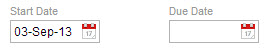
The Calendar opens.
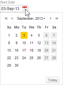
- Click the date to be defined.
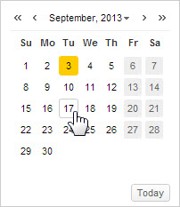
The Calendar closes and the Date field updates with the defined date.
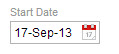
Selecting Single Find Window Items
- Select the item (or item type) radio button.
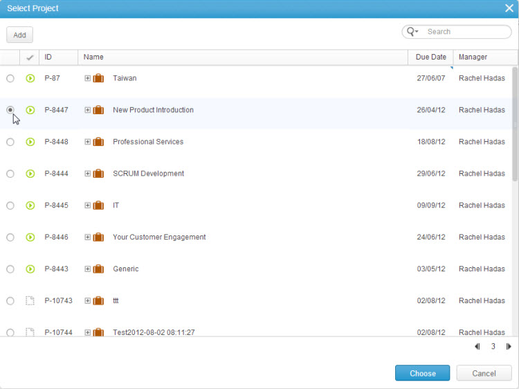
Figure 80: Select Project Window
- Click

The item or item type is selected , the panel refreshes accordingly.
Configuring Multi-Find Windows
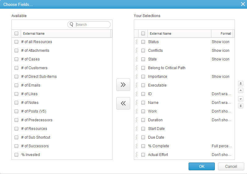
Figure 81: Multi-Find Window
- Click
 to filter a Search.
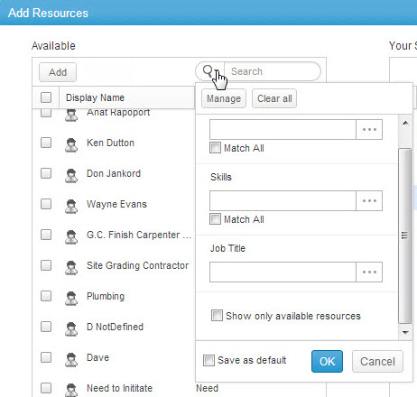
Figure 82: Search Filtering
- Click
 to open a Choose Fields multi-find window
 - Click
 to clear all filters
 - Enter data into a filter field
OR
- Click
 to open a multi-find window to select an item type filter
 - Click

- Check
 to select all available list items
 - To sort by first or last name, click

Selecting All Items
To select all Items :
- Click

All checkboxes become and all window Item rows are highlighted.
 - Click
 again to un select all Items.
Selecting Multiple Items
To select multiple Items in the window:
- Click two or more
 adjacent to w indow Items.
The becomes
The selected Items' checkboxes become and the Item rows are highlighted.
 - Click
 twice to un select the Items .
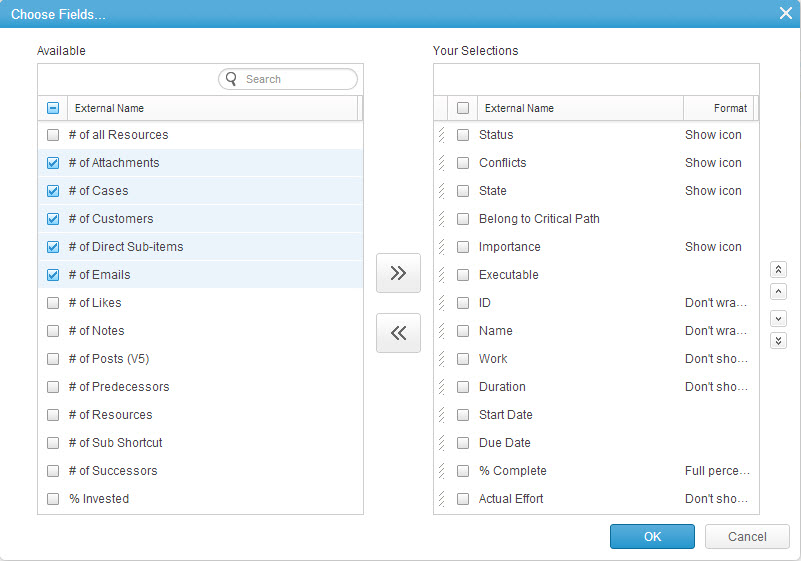
Figure 83: Multiple Selections
Searching for available list items
- Enter text to

Selecting all available list items
- Click

Selecting individual or multiple available list items
- Click
 aligned to items.
Adding or removing list items to the Your Selections column
- Click
 or
or 
Sorting the vertical list order
- Check
 (s) in the Your Selections column and use the
  controls.
Formatting
Changing Items type Formats:
By selecting the Manager you can choose the fields to appear in your display.
Choose the required fields from the Available column, and using the arrow button move them into the ‘Your Selections’ columns on the right-hand side. Move the column locations and chose them according to your preferences by clicking the
arrows, or drag and dropping. Additionally, you can select the format; either as a text, icon, or both.
Click OK and you’ll find the new added columns in the refreshed window.
- Click an Item type in the Format column.
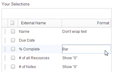
Figure 84: Select Item
The Item Type menu opens.
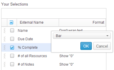
Figure 85: Item Type Menu
- Click
 to reveal the format options.
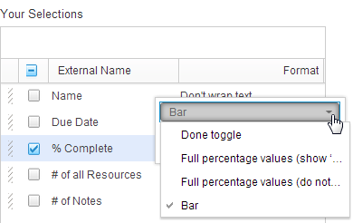
Figure 86: Format Options
- Select the format.
- Click

- C lick
 on the Choose Fields multi-find window.
Viewing Data Previews
This page describes viewing data previews and includes the following sections:
About Data Previews
Clicking the  Quick Peek enables previewing and managing an item’s data (where applicable) in a Data Preview pop-up, including the item's addable relations and Properties Card, while simultaneously maintaining the context of the current view/module and item. The pop-up default display can be defined as thumbnails (DEFAULT) or a grid by your organization's Admin user.
The two types of previews are:
Multi Relation Preview
Multi relation previews are accessible for items without a Relations Panel (such as items in a Relations Panel, search results, Find windows, etc.). Multi relation previews display the item’s name and the short path (if applicable); a link to access the Properties Card, and displays the item’s (non-empty) relations, the first relation is open by default.
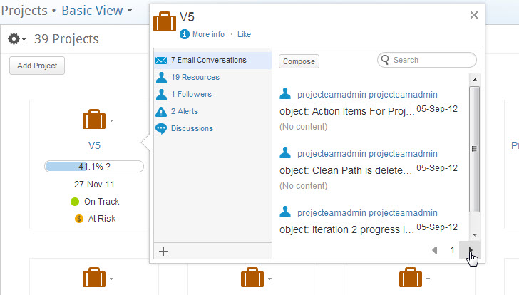
Figure 87: Multi Relation Preview
Icon and text links in the left pane — such as Emails and resources — shows a counter of linked items of that type.
- Click the the left-hand side pane links to view the related information in the right-hand side pane.
Buttons and fields enable the following actions:  (for Email Conversations) — opens a Clarizen email compose window
 (for resources ) — opens the Add Resources multi-find window
  — Contextual Search
  and
and  — pages forwards and backwards
 — opens the Add Related window
Single Relation Eye Peek
Single relation previews s how one relation and are accessible from counter fields (for example the number of work items).
Figure 88: Single Relation Preview
About the Quick Peek
The  Quick Peek is available in several locations in Clarizen, including:
- Thumbnails
- Relations fields in a grid ( resource , dependencies)
- Adjacent to item identifier fields (item name)
- Relations Panel
Hovering the mouse pointer over the item name in these locations exposes the  Quick Peek.
Viewing Data Previews
- Hover the the mouse pointer over the item name.
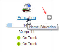
Figure 89: Expose Quick Peek
The  Quick Peek is exposed.
- Move the mouse pointer to the right horizontally over

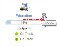
Figure 90: Reposition Mouse
- Click

The system loads the item's preview.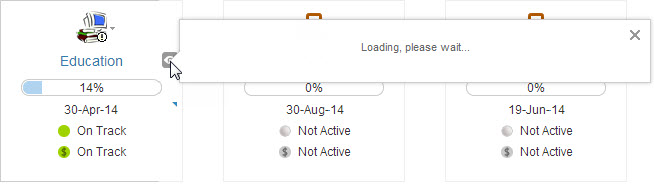
Figure 91: Loading Data
The item's data preview opens, the current Clarizen view context is maintained.
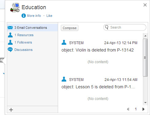
Figure 92: 'Education' Project Data Preview
Changing the Default Display
The default Data Preview pop-up display option of a specific item can be defined as either a thumbnails layout or as a grid.
See the Profiles setting chapter for more on how to define default views.
Creating, Editing and Deleting Views
Managing views in Clarizen is done via the View Navigator. This page describes managing Clarizen views and includes the following sections:
- About Creating New Views
- Creating a New View From Scratch
- Renaming Existing Views
- Editing a View
- About Managing all Views
- Selecting a View to Edit
- Deleting Views
About Creating New Views
Clarizen enables you to create new views to provide the optimal way of absorbing information needed to successfully manage and execute work.
Once created, a new view appears (as the first view) in the View Navigator.
Clarizen also enables you to edit and save existing 'out-of-the-box views (created by Clarizen) or public views (custom-designed ) as 'new' views, in order to provide you with an optimal way of absorbing information needed to successfully manage and execute work.
The ability to edit either Module or item Detail views to create new ones, including a quick and easy method for renaming views ( to suit specific needs), solely depends on your user permission level and how view sharing is defined (shared or private).
For Module views, depending on the module item type, the view may be customized to include the Team Panel; include, remove, sort and filter grid columns, have the main panel data set to a chart or thumbnail display, and have other filters defined.
The customized view can be defined as either a private view, a financial view, or be set as a shared view for either specific users, user groups, virtual groups and even profiles.
You can access the 'View Editor' directly from the View Navigator (to edit the current view), or from the View Manager (to select a specific view).
Creating a New View From Scratch
- Click the View Navigator link located under the company name on the masthead.
Figure 93: View Navigator Link
The View Navigator drops down. The currently selected view is highlighted in blue.
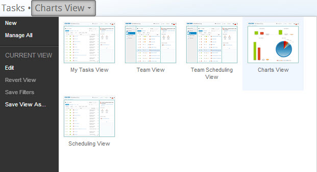
Figure 94: View Navigator
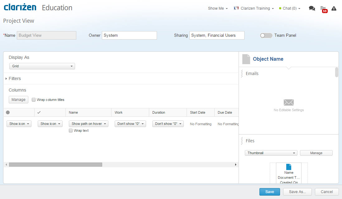
Figure 95: View Editor
- Define the view settings:
- Enter a view name to the Name field
- If applicable, change the Owner in the Owner field
- Select the relevant sharing option from the Sharing field:
- Click Owner Only to create a Private View for personal use
- Share the view with a specific user, user group, virtual group, or profile
- For each of the entities the view is shared with, define the sharing level, define each as either a Viewer or Editor
- Click the Team Panel control to add it to the view
- Define the Display As drop-down menu options:
- Grid
- Chart
- Thumbnails ( DEFAULT )
- Edit the filters
- Manage (configure) the column fields
- Click

The new view opens.
The new view is saved in your Clarizen profile settings, and is ordered as the first view appearing in the View Navigator.
- Open the View Navigator.
The currently selected view is highlighted in blue.
- Select a different view to rename (if necessary).
- Click Save View as...
The View Editor opens containing the edit options relevant for the selected view.
The text 'Copy of.. and the view name appears in the Name field.
Figure 96: Copy of View
- Select the text in the name field and enter a new view name.
- Edit other view settings as necessary.
- Click

The existing view is renamed, and opens in the main panel.
Editing a View
- Open the View Navigator.
The currently selected view is highlighted in blue. - Select a different v iew to be edited (if necessary).
- Click Edit .
The View Editor opens providing the edit options for the selected view:

Figure 97: Selected View Editor
Edit module view actions (when enabled):
- Select to Import or Ignore any previous customization changes made to a view
- Edit the Name field
- Define the Sharing options
- Click the Team Panel control to add it to the view
- Define the Display As drop-down menu options:
- Grid
- Chart
- Thumbnails ( DEFAULT )
- Edit the filters
- Manage (configure) the column fields
- Define the Relations Panel
- Arrange Relations Panel panel locations (click and drag)
- Select to Import or Ignore any previous customization changes made to a view
- Edit the Name field
Edit Item Details view actions (when enabled):
- Edit the Name field
- Define the Sharing drop-down menu options
- Enable the Roadmap control in order for it to appear (or not)
- Choose the layout option
 :
: - One Column Layout
- Two Column Layout
- Define the panel data settings for each panel
- Arrange panel locations ('drag and drop')

- Click

The screen updates reflecting changes made to the view.
OR
Click
The Save View As window opens enabling a choice of existing views to replace with the edited view.
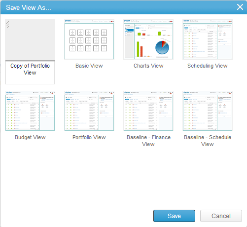
Figure 98: Save View As... Window
- Click

The selected view is replaced by the edited view.
About Managing All Views
Managing either all Module or item Detail views is achieved via the Clarizen View Manager , accessed by clicking Manage All in the View Navigator menu.
- Open the View Navigator.
The currently selected view is highlighted in blue.

Figure 99: The View Navigator
- Click Manage All .
The View Manager opens (replacing the View Navigator).

Selecting a View to Edit
- Open the View Navigator.
- Click
 on the thumbnail of the view to edit.
The View Editor opens. - Edit as necessary.
- Click

The edited view is replaced by the edited view.
Deleting Views
Overview
The ability to delete views is solely dependent on a user's permission level and how the view is defined (default, public or private view) by the organization’s Clarizen Admin User.
View creators can delete their own views.
Owners and view editors can delete views they are assigned.
Adminstrators can delete any views.
Unlike hiding views, deleting a view will delete it for all users in the system.
If other users have saved personalized versions of the view being deleted, their versions will not be affected.
Deleting Views
- Open the View Navigator.
- Click Manage All .
The View Manager opens (replacing the View Navigator).
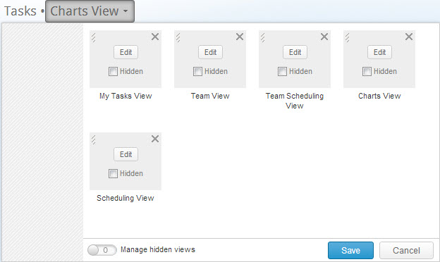
Figure 101: View Manager
- Click the
 on the thumbnail of the view to be deleted.
The thumbnail' changes to
  and the thumbnail's caption appears with a 'strike-through'.
- Click

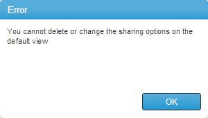
Uploading a Custom Icon
This page describes how to upload a custom icon to a properties card.
- Click the default icon located left of the name field i n the Add New window.
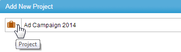
The field menu drops down.
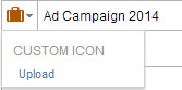
- Click

- Browse to the image file required, and load it.
The data is sent to the server. The custom icon appears in the icon field, replacing the default icon.
The Revert to default option is added to the field's drop-down menu.
Manually Changed Fields
By manually changing data in certain Clarizen fields you can cause updates to other fields are automatically calculated. This is particularly relevant when scheduling projects.
For example, if you manually change the duration days of a task, Clarizen automatically reschedules the dates in the start and end date fields.
Manually Set Indicator
When you update or overwrite system calculated values, you'll see a blue triangle marking the relevant field.
Clarizen displays a conflict indicator to let you know when manually set fields should be automatically adjusted.
Certain conflicts in Clarizen may be prevented by removing the manually set flag which enables Clarizen to automatically resolve the conflict, e.g. automatically calculate start/end dates or duration days.
You can restore a field to be calculated by Clarizen by hovering over the field and clicking the restore link in the tooltip.
Manually Set Scheduling Fields
The following scheduling fields may be manually set:
- Track Status (Schedule Status)
- Duration
- Start Date
- Due Date
- Actual End Date
This table illustrates system-calculated rules for some specific scenarios when changing start/end dates and duration days for a project:
| Event | Affected work item | Start Date | End Date | Duration Days |
|---|---|---|---|---|
| Creating a Project | Project | Today | Today + 1 year | 1 year |
| Adding a milestone | Milestone | Today | Today | 0 days |
| Adding a task | Task | Today | Today + 1 day | 1 day |
| Changing start date of work item | work item | Manually changed. | Moves according to number of duration days. | Remains the same. |
| Changing end date of work item | work item | Moves according to number of duration days. | Manually changed. | Remains the same. |
| Changing start/end date of task that resides under parent project/milestone or task | Parent project/milestone or task | Earliest start date between all sub-items. If field was set manually the system raises a conflict. | Latest end date between all sub-items. If field was set manually the system raises a conflict. | Longest duration days between all sub-items. If field was set manually the system raises a conflict. |
| Changing duration of the work item | work item | Stays the same, unless end date was manually set and then the system calculates end date - duration. | Start date + duration. If start date was manually set before to a different value, the system raises a conflict. | |
| Changing duration for work item under a parent work item | work item | Earliest start date between all sub-items. If field was set manually the system raises a conflict. | Latest end date between all sub-items. If field was set manually the system raises a conflict. | Longest duration between all sub-items. |
Manually Set Work Fields
The following work-related fields may be manually set:
- Work (Planned Effort)
- Actual Effort
- Remaining Effort
- % Completed
Manually Set Finance Fields
The following work-related fields may be manually set:
- Budget Status
- Budgeted Cost
- Expected Revenue
- Fixed Cost
- Fixed Price
- Actual Cost
- Actual Revenue
Using Manually Set data in Customizations
You can test whether a field is manually set using Clarizen's Business_Rules, for example you might want to trigger a notification when a project's due date is manually set, or prevent a work item's duration from being manually set.
Details of customization and functions are here
Comments